Anna Bartlett ▸ Central Co-op ▸ Brand & identity
Brand & identity
The system the office went out into the world with.
THE BRIEF · WHAT WAS ALREADY DECIDED
The mark was given. Everything it had to survive was not.
Central Co-op did not need a logo. It is a Northeastern office, and Northeastern issues its offices a finished identity — the N-motto, the wordmark, the monogram, four colourways, a portal to download them from. That part was settled before I arrived and I did not draw it.
What was not settled was any of the places the office actually met a student: a pair of roll-up banners tall enough to find across a hall, a table that had to explain co-op to a stranger in ninety seconds, and something small enough to put in a pocket and find again in April. A downloadable logo does none of that. Six months of this co-op was the distance between a mark and a system.
THE PAIR · ONE SKELETON, TWO WARDROBES
Two banners, three beats.
The office needed more than one banner and it could not look like it had bought them separately. So the two were built on the same three-beat spine, and only the middle changed.
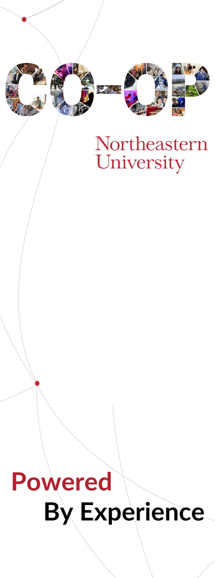
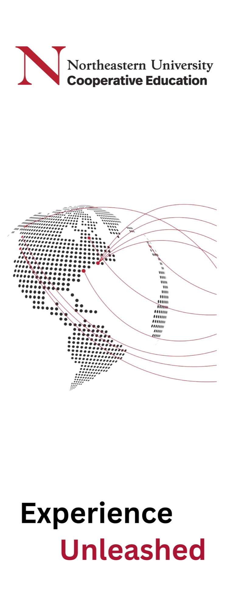
- 01
Lockup, top-left, always
One anchor at the top and nothing competing with it. On the first banner it is the photo-filled CO-OP over the university signature; on the second it is the Cooperative Education N-motto. Either way the first thing you read is who is talking.
- 02
A connection motif in the middle
Both carry the same idea in different weights — hairline arcs with red nodes on one, a dotted globe throwing red flight paths on the other. It is a lot of empty white by design: at eight feet, read from across a hall, the middle of a banner is where a body stands.
- 03
Two words, one of them red
The line lands at the bottom in two stacked words with the accent on alternating halves — Powered / By Experience, Experience / Unleashed. Same construction, opposite emphasis, so the pair reads as a set from across the room.
The first banner is the one I would defend hardest. Setting CO-OP in a mosaic of student photographs means the headline is made of the thing it is claiming — you cannot read the word without looking at the people.
ON THE FLOOR · WHERE IT HAD TO WORK
A brand you can only see in a PDF isn’t finished.
All of it deployed at recruiting and admitted-student events — which is also where you find out what you got wrong. The banners read from across a hall. The table needed the printed one-pager to do the talking, because at a career fair nobody stops long enough to be talked at.
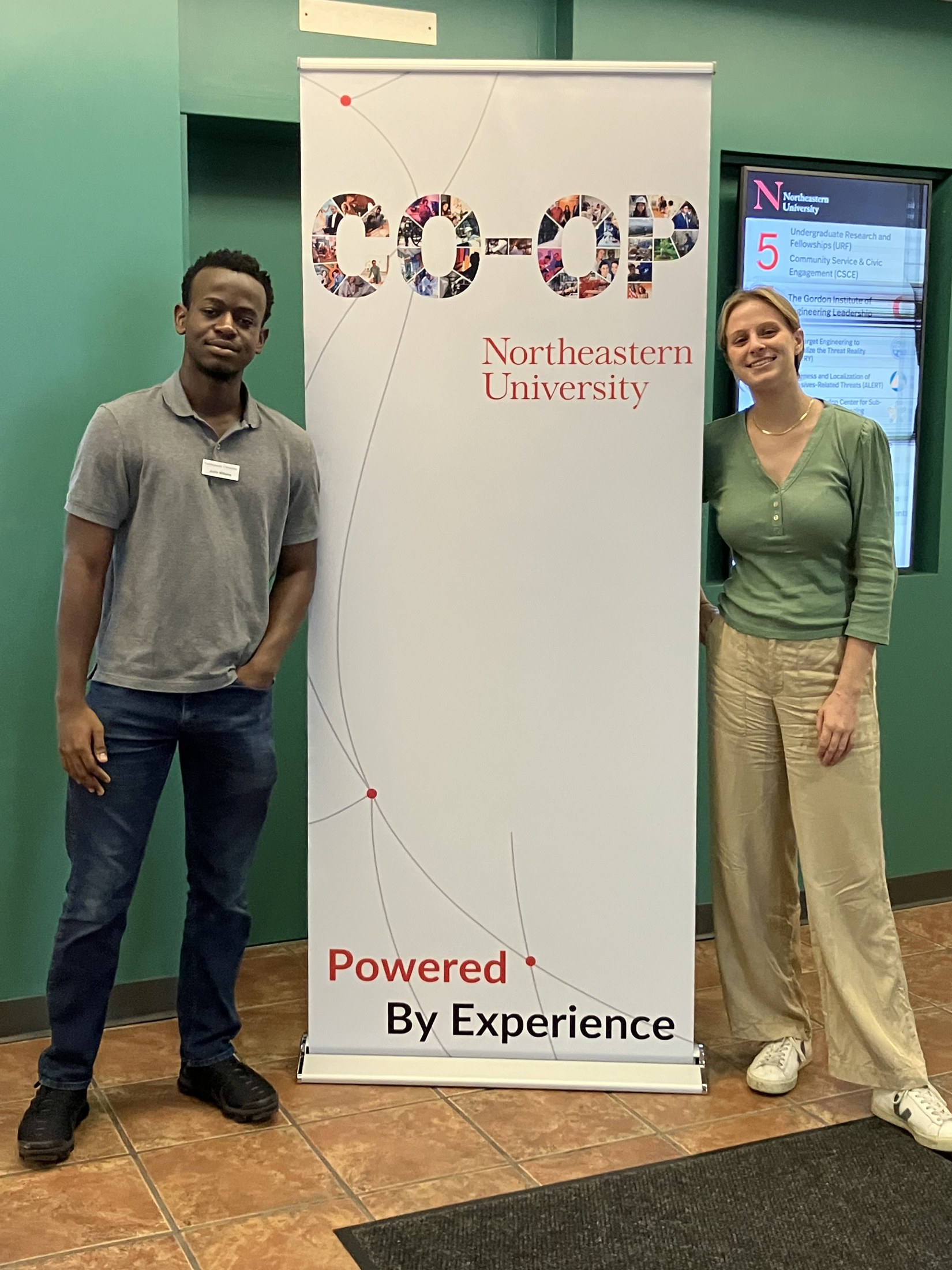
Eight feet of it, in the lobby it was built for. 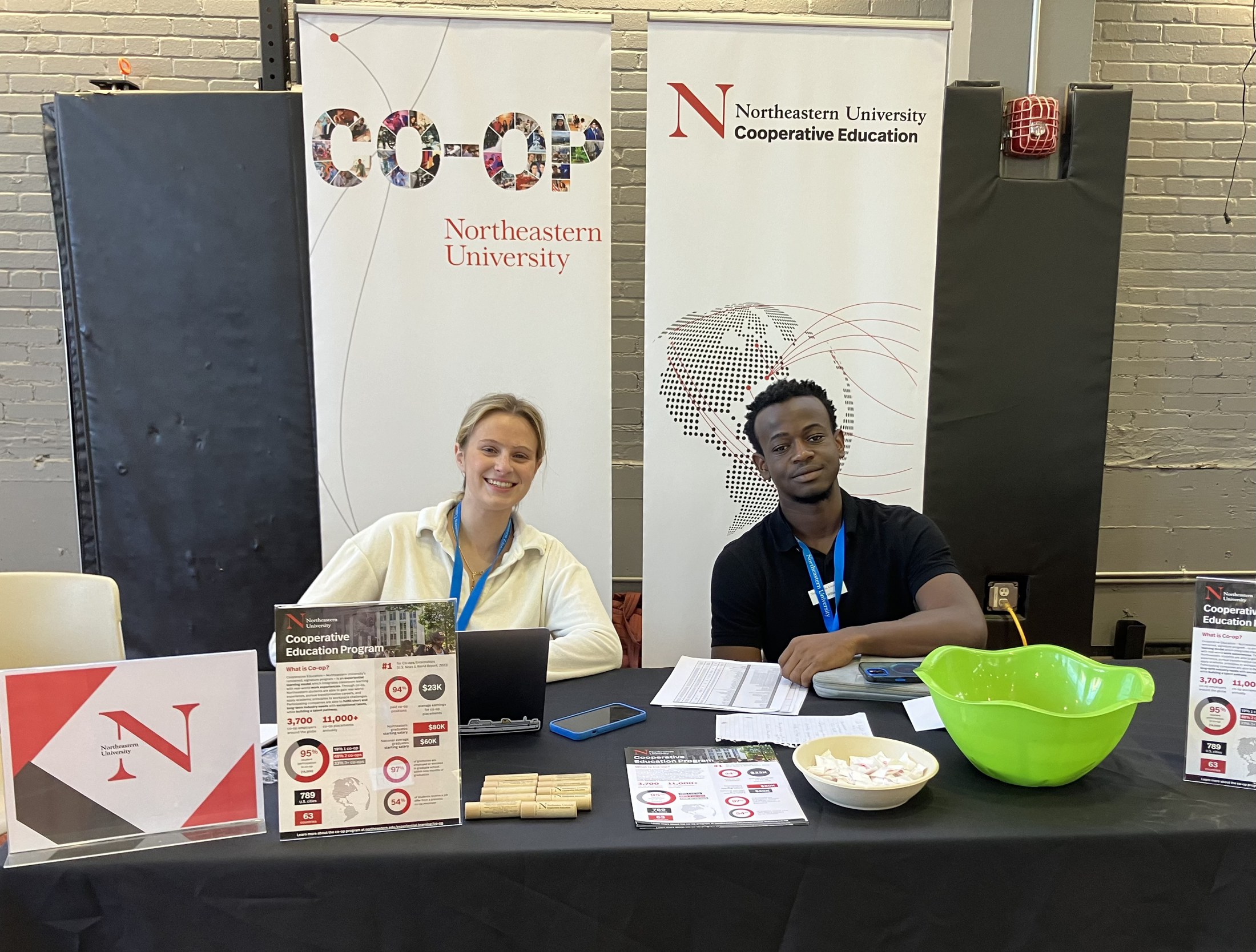
Both banners behind the table — the pair doing the job it was designed for. 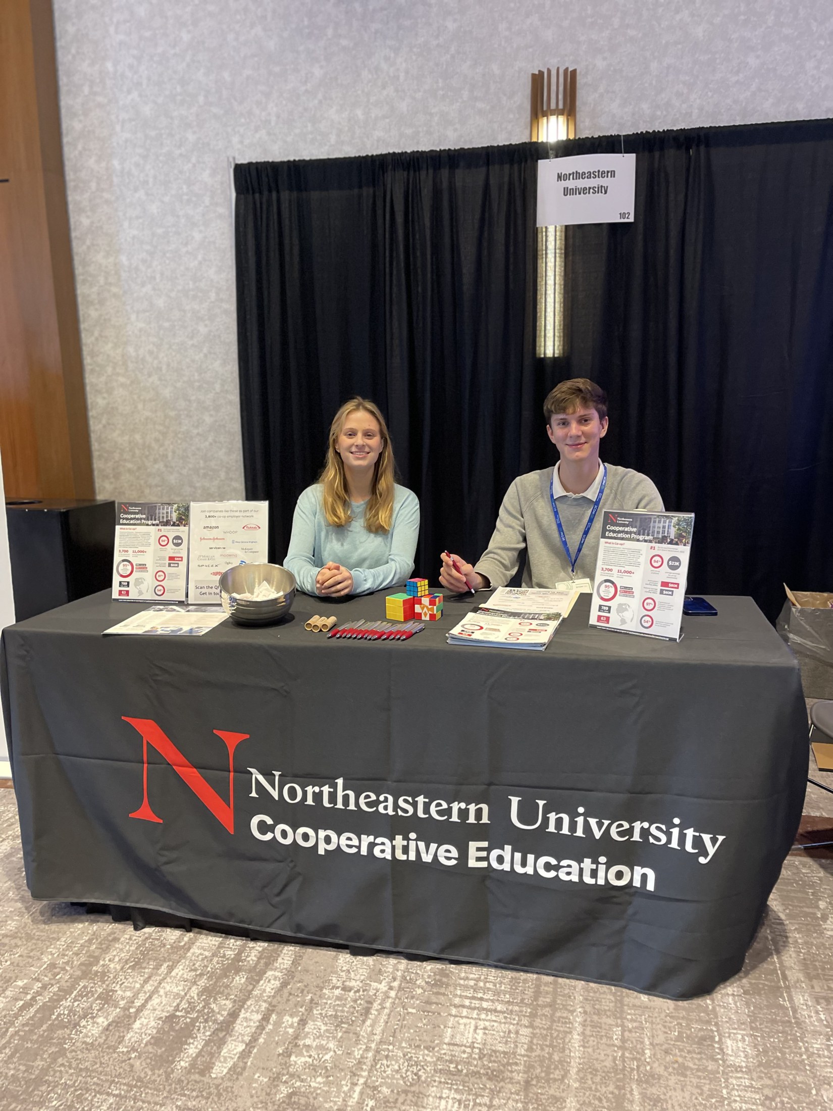
The booth kit: tablecloth, easel one-pagers, pens, mints, cubes.