Anna Bartlett ▸ Generative Systems ▸ Boston Symphony Orchestra
FOLDER 06 · OPENED
I Taught Code to Listen to Beethoven
What five symphony posters taught me about designing rules instead of artifacts.
01 · THE OPENING
The wall was a door.
I didn’t study code. For most of design school, that felt like a wall — code was a medium for engineers, and I designed around it.
Then I took a class called Algorithmic Graphic Design, opened a blank p5.js template, and found out the wall was a door.
The brief: design five posters for the Boston Symphony Orchestra. But the real assignment was hiding underneath it — don’t design five posters. Design a system that designs posters, rigorous enough that you could hand it to the person sitting next to you, and their poster would still look like it belongs to the family.
That one constraint changed how I think about design. Here’s how.
02 · THE PROBLEM
The problem isn’t the poster.
A symphony poster is marketing more than a composer — it’s marketing the orchestra bringing that composition to life. It has to argue, visually, that hearing this music live is a full-body experience you will never get from a streaming service.
Now multiply that by an entire season. Every night is a different composer with a different feeling, but every poster has to be unmistakably one orchestra. That’s the tension: each poster needs its own personality, and the family needs cohesion.
You can brute-force that manually. But when you’re hyper-focused on making each poster feel individual, you zoom out and realize you’ve lost the thread that unifies them. That constant zooming in and out is the most exhausting part of being a designer.
So instead of designing posters, I designed the rules — and let the rules design the posters.
03 · THE TOOLKIT
It started with a square.
The first thing we learned to make in p5.js was a square — how to generate squares anywhere on the artboard. That’s it. That was the whole toolkit.
So I started listening. I played each composer and paid attention to what the music did to me — did it raise my heart rate or calm me down, what picture was it painting? Then I tried to translate that feeling into parameters. Should the squares nest inside each other? Cascade from one corner and descend to the other? Thicker strokes for Beethoven, finer ones for Mozart?
I’d set the parameters, generate a background, and hold it against the music. If it didn’t feel like the piece, I didn’t fix the poster. I changed the code.
That loop — listen, translate, generate, compare, adjust — became the entire project. I wasn’t debugging code the way an engineer does, hunting for errors in the syntax. I was looking for errors on the artboard. That, I realized, is what a designer looks like in a computational space.
nothing here is drawn by hand
EVOLUTION · THE CODE BEHIND THE SEASON
One sketch. Four moves. A whole season.
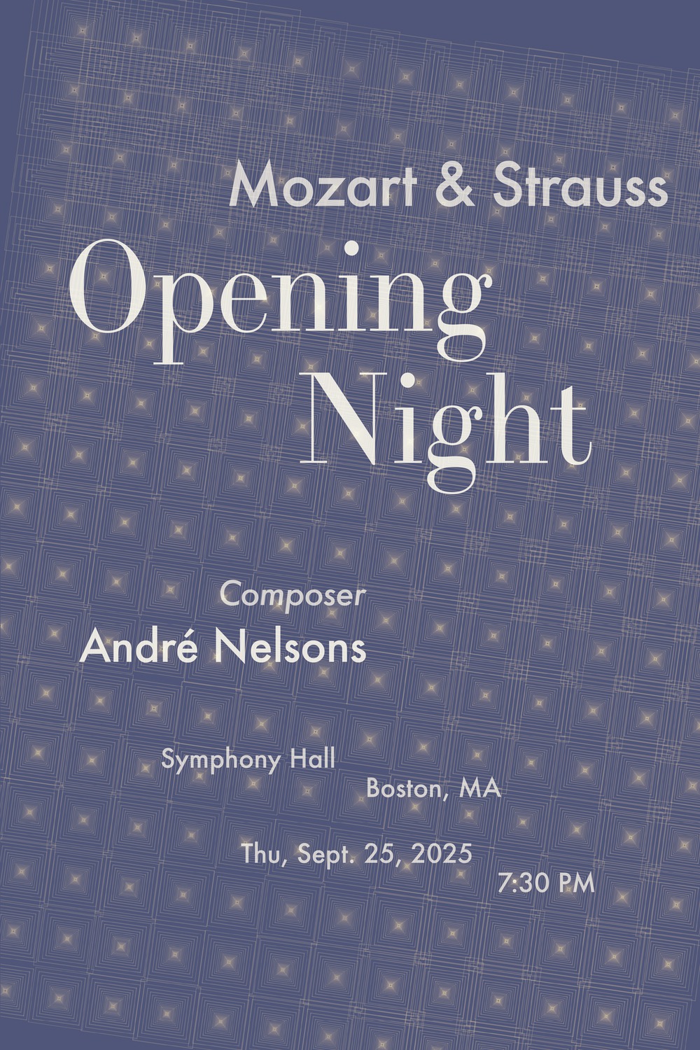
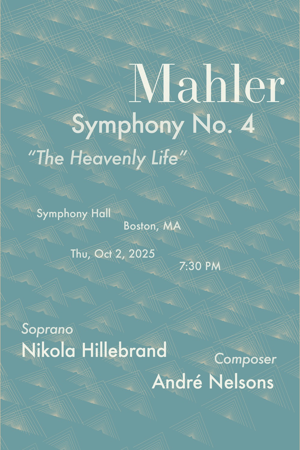
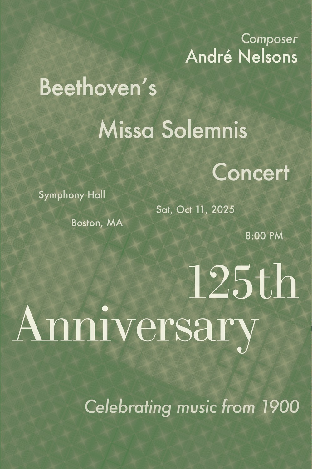
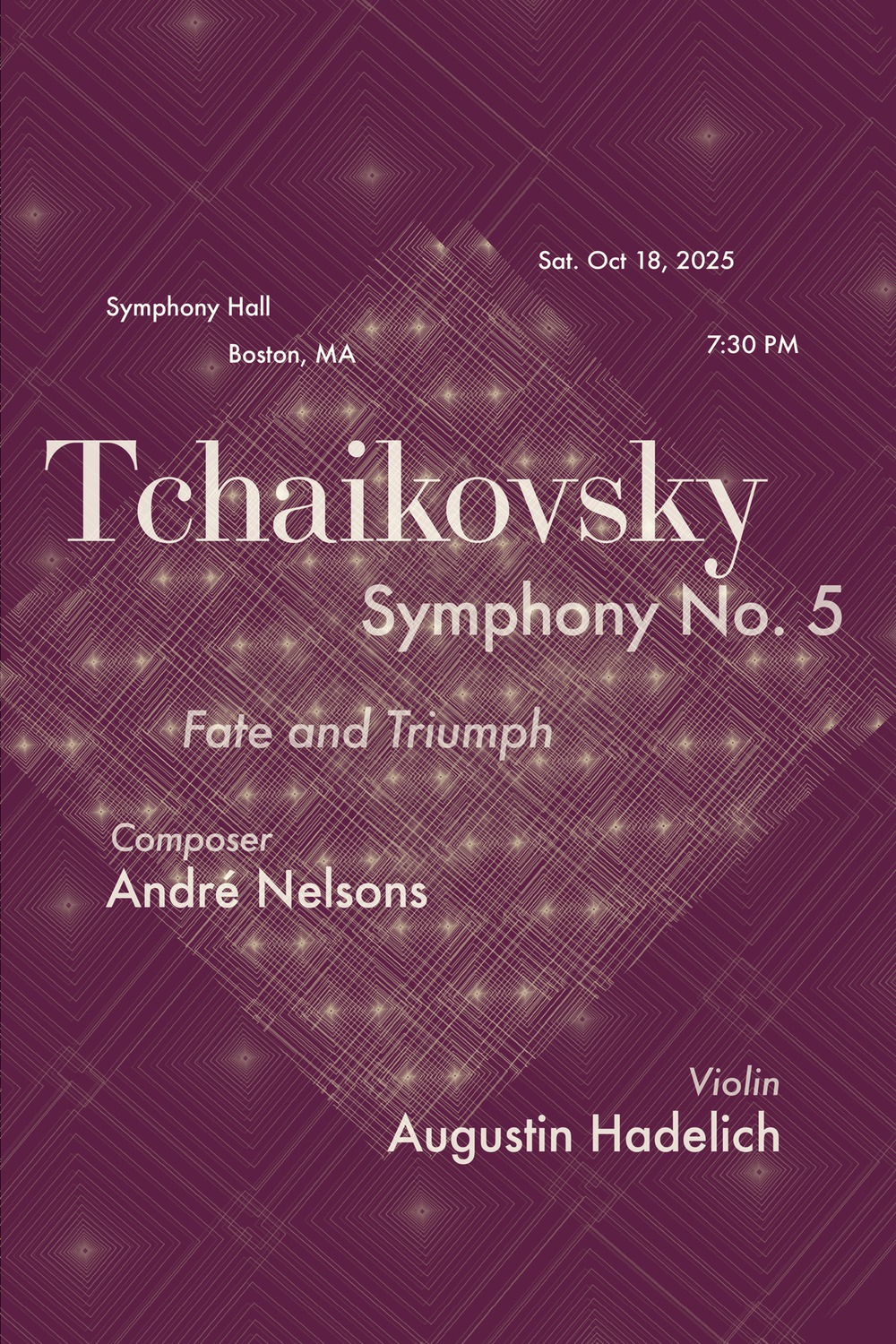
Not one of these posters is drawn by hand. There is a single p5.js sketch, and each stage below is the same code carried one step further — a designer turning dials, then teaching the system to hold real typography — until five nights of the season share one set of rules and five different feelings.
STAGE 01
Nine Posters — the seed system
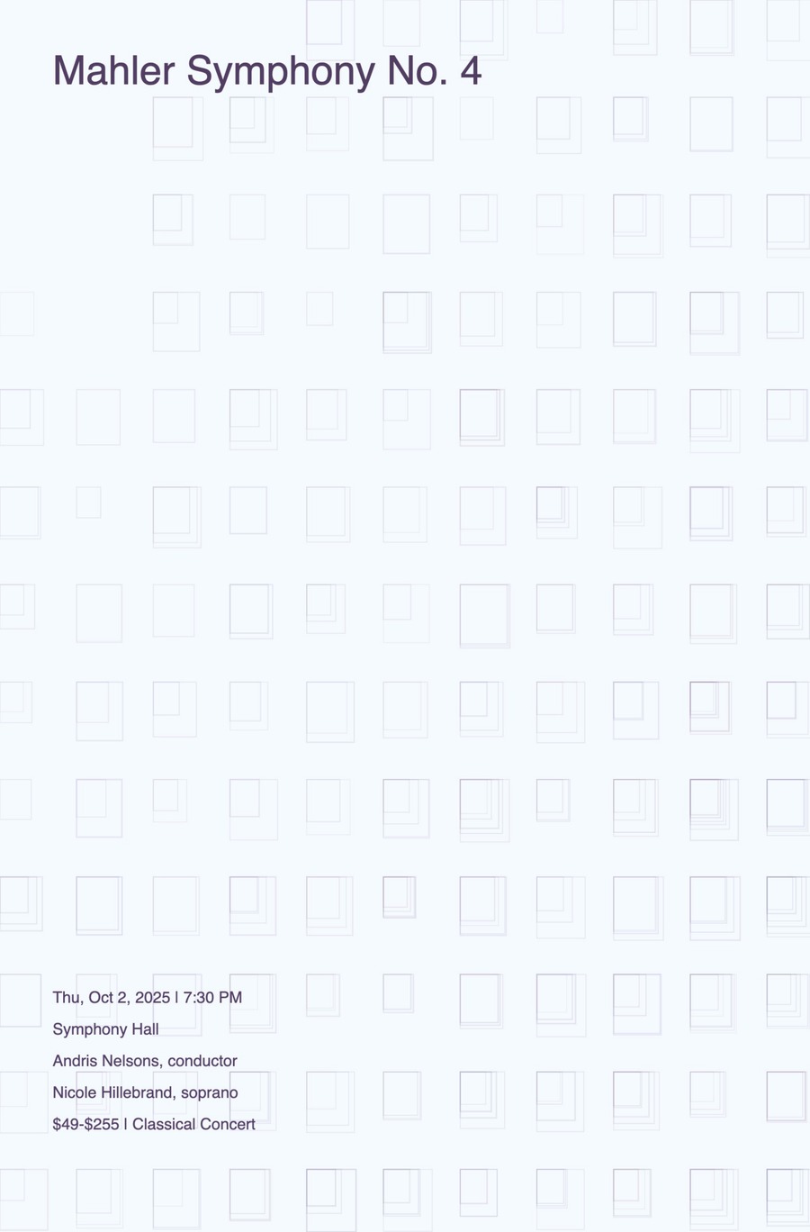
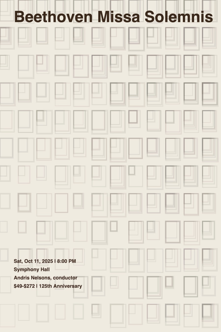
The origin sketch. It began as an audio-frequency visualizer — FFT bands and oscillators — then I rebuilt it into a grid of nested rectangles driven by Perlin noise and a short list of parameters. Nine quiet outputs prove the point: one sketch, one click, three concerts × three seeds.
STAGE 02
Milestone 01.03 — turning the dials
Same code, dials cranked. I pushed gridScale, noiseScale and strokeAlpha far apart and swapped a palette per concert. Nothing is redrawn — each poster is a different feeling pulled from the same loop by changing numbers.
SCROLL →
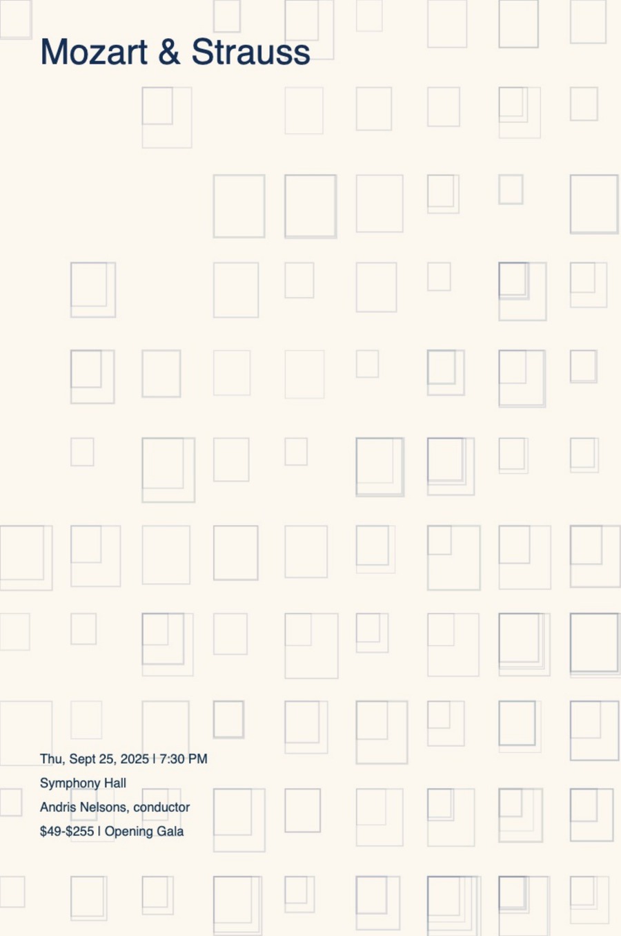
STAGE 03
Refinement — type meets the field
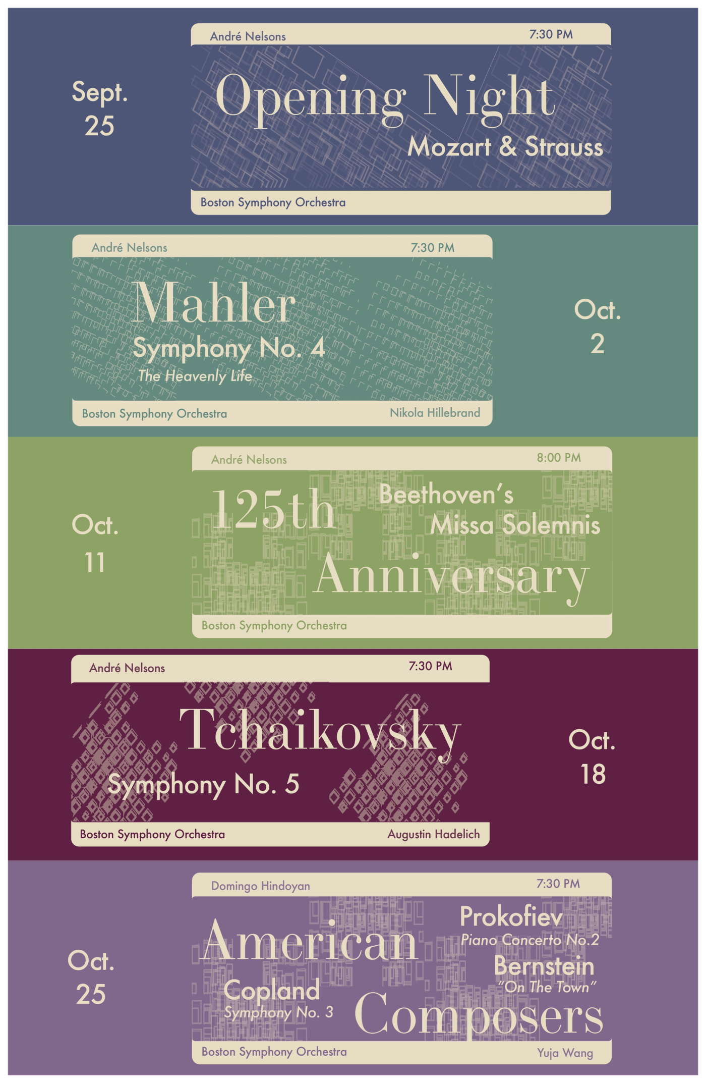
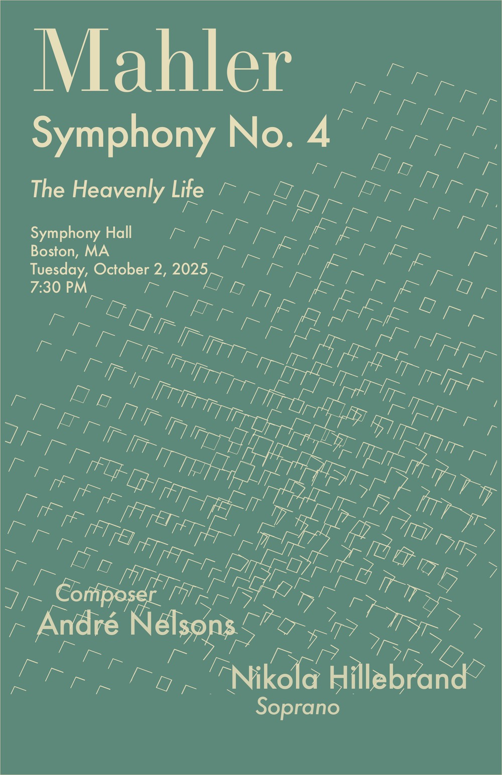
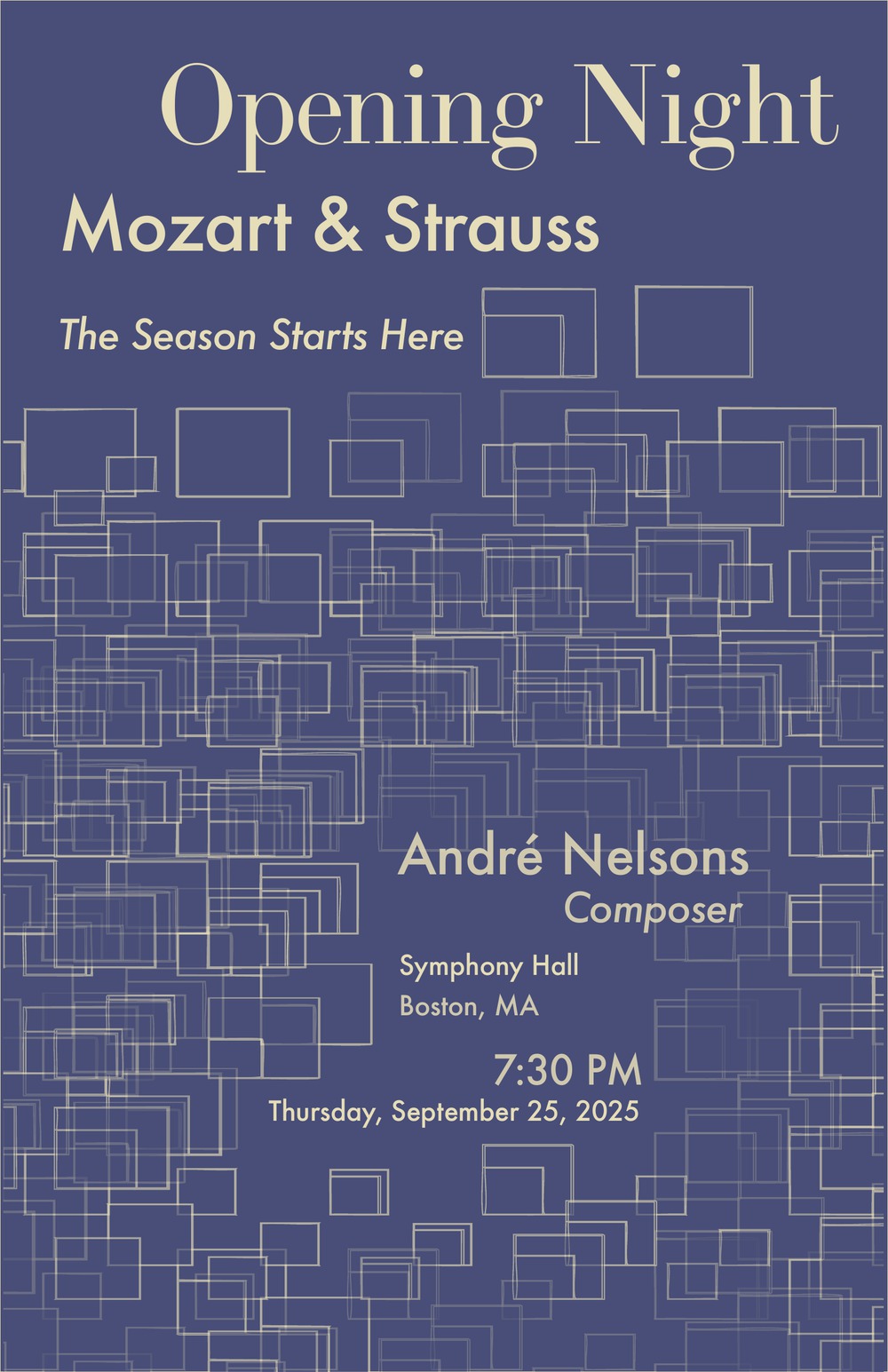
I demote the generative field to a background layer and composite a fixed type system — display serif over a sans event block — on top. The parameters now tune texture behind real hierarchy instead of being the whole poster.
STAGE 04
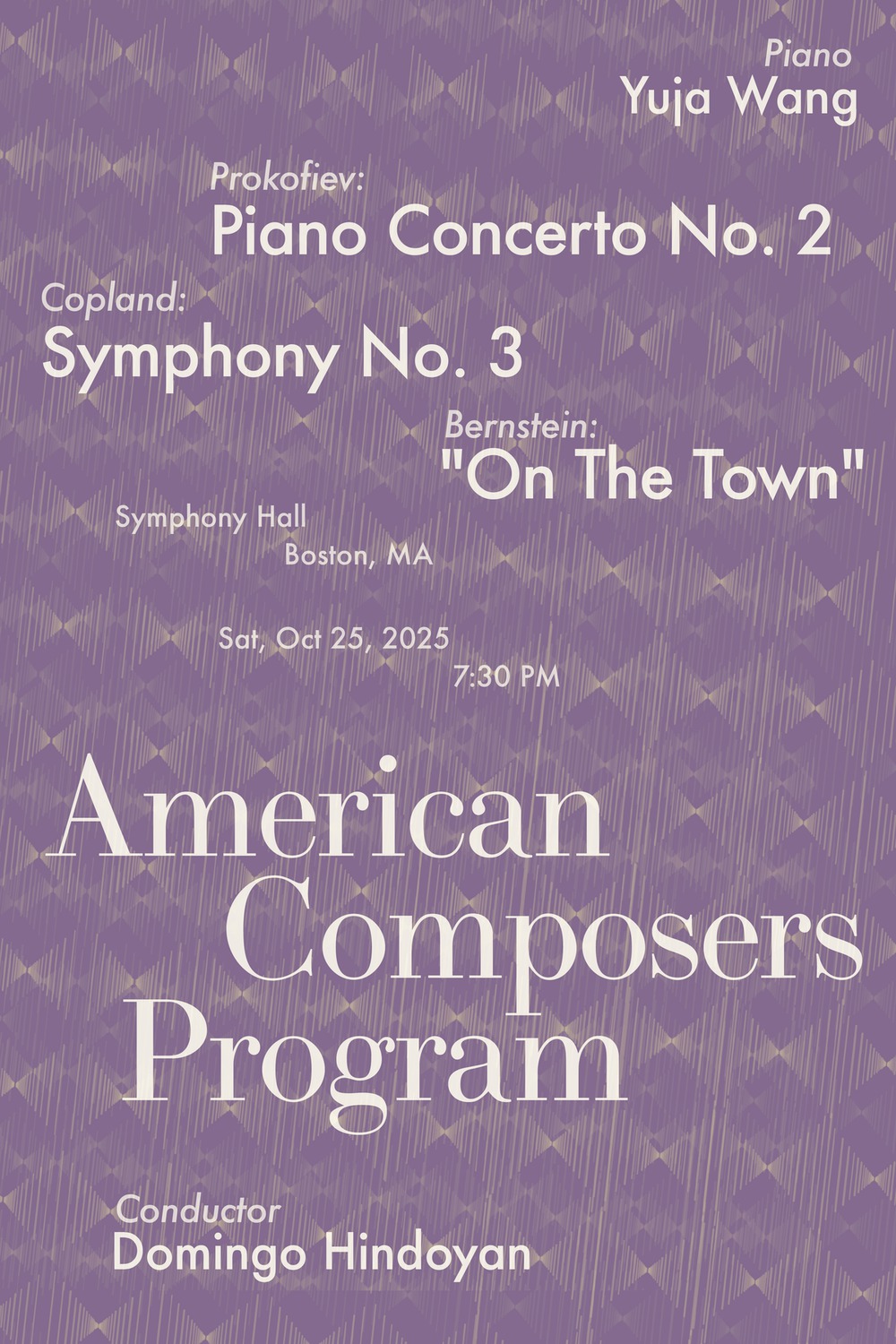
The season — a signature per night
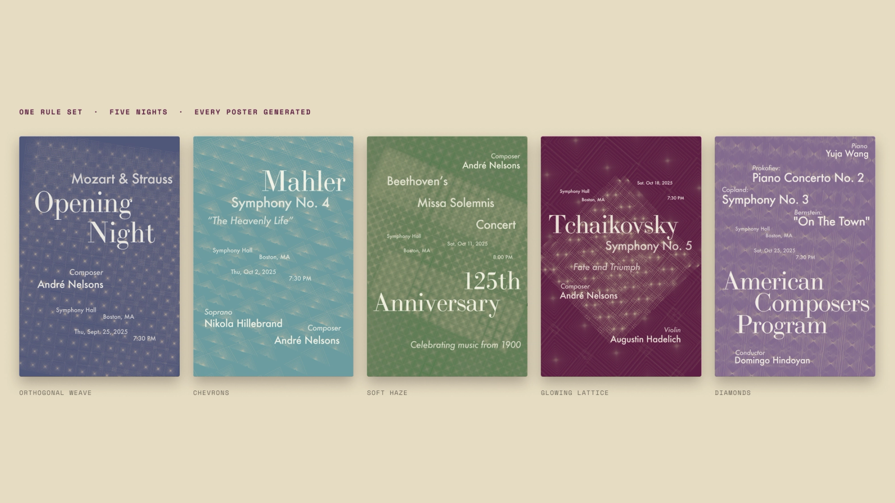
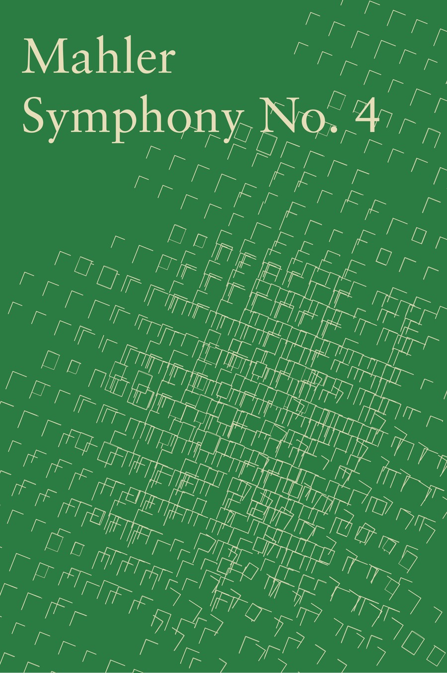
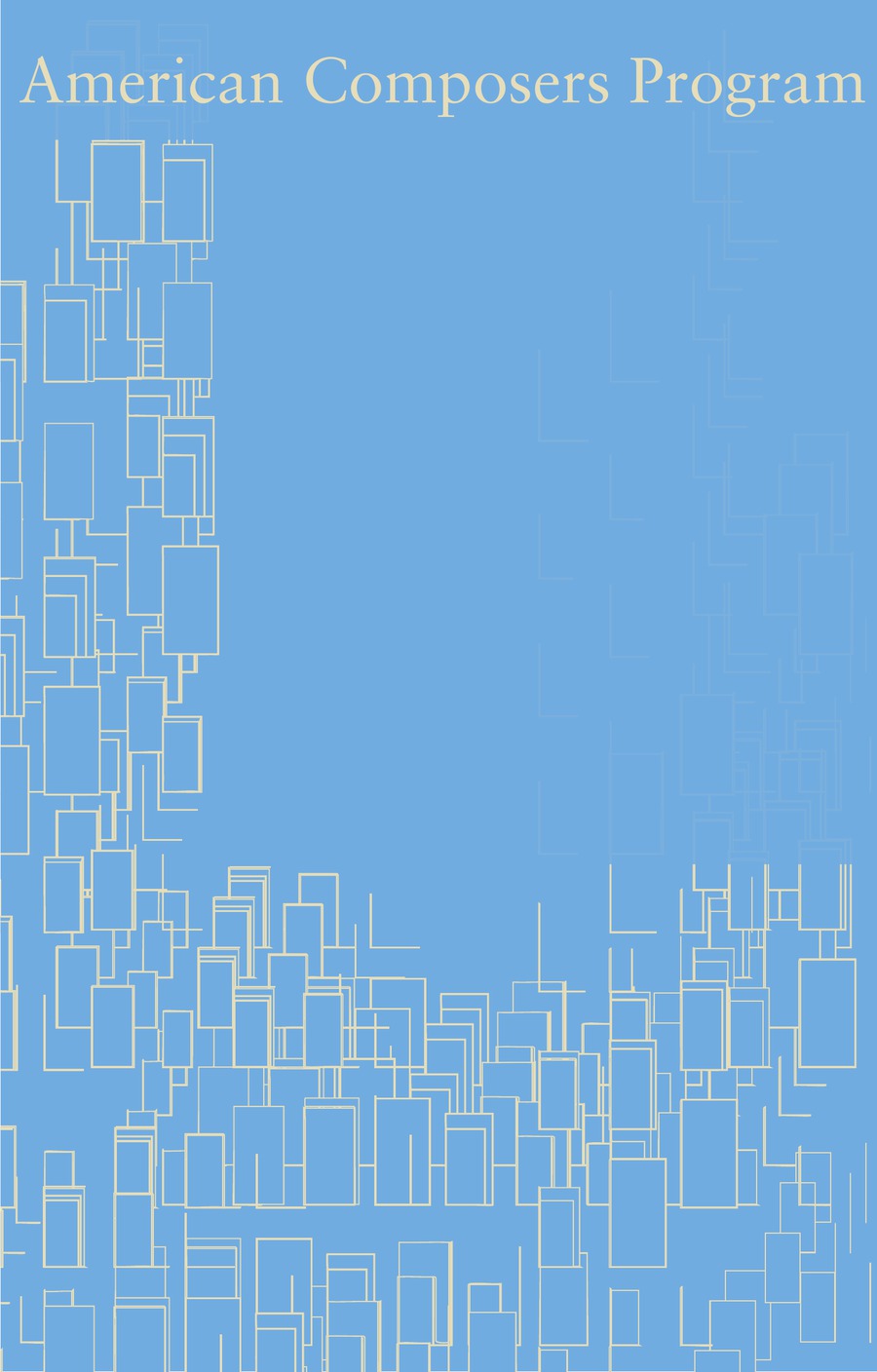
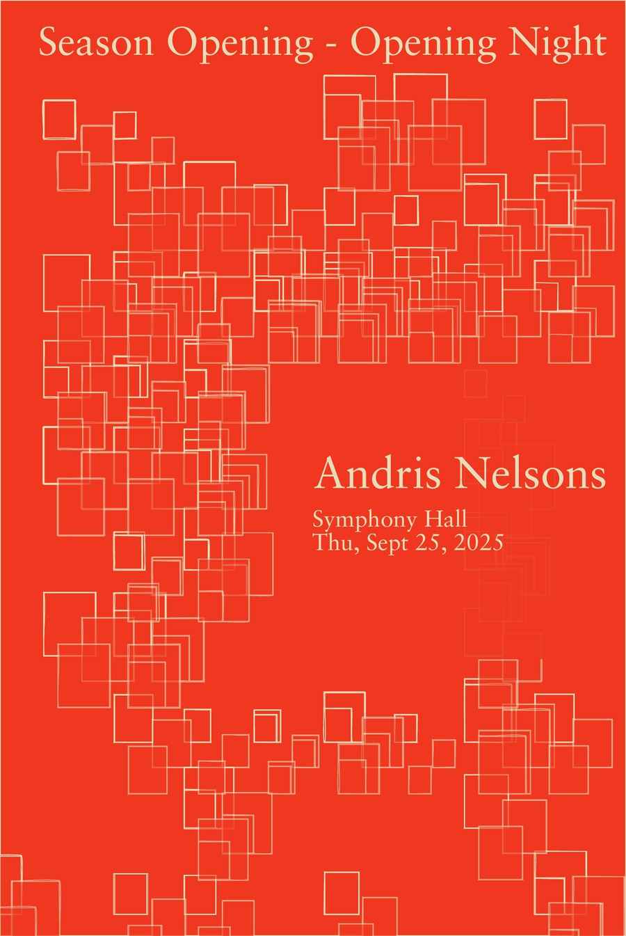
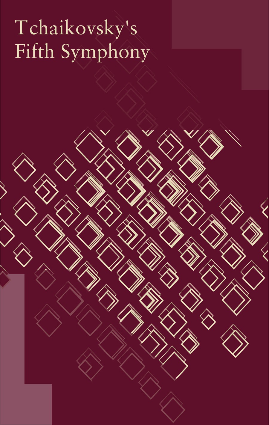
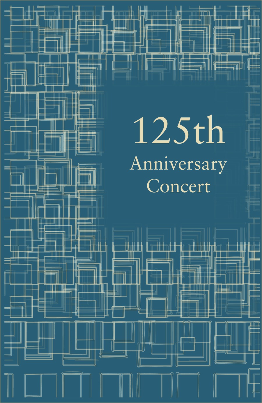
Each night gets its own locked parameter set — a signature. Chevrons for Mahler, orthogonal weave for Opening Night, diamonds for the American program, a glowing lattice for Tchaikovsky, soft haze for the 125th. One type system, five textures, one season.
SCROLL →
04 · THE SYSTEM
An algorithm is just a brand book that runs itself.
Working inside an algorithm feels restrictive at first. Then you realize: writing lines of code is just writing instructions — the same instructions you’d give a team of designers. Use this font. The artboard is these dimensions. Respect the margins. Stay on the grid.
I’d been building design systems in Figma for years. This was the same discipline in a new medium.
The difference is where the creativity lives. In a generative system, the parameters are where something unique is born. Set them with intention and the black box becomes something else — a box of possibilities under constraint. There’s room for play, but the play never leaves the playground.
The LinnDrum machine had 15 drum sounds built in. Fifteen. And the amount of music that came out of those 15 sounds crosses genres, artists, and decades. Constraints don’t kill creativity. They launch it.
the music sets the parameters
THE PARAMETERS · SAME CODE, THREE NIGHTS
The music sets the parameters.
Before each poster, I tuned a handful of parameters to the feeling of that night’s programme — a calm Mozart opener, a triumphant Tchaikovsky, a monumental Beethoven anniversary. The same code produces all five; the piece decides the colour, the form, and the density.
dense chevrons · noise 0.03
Mahler · Symphony No. 4
diamonds + glow · layers 8
Tchaikovsky · Symphony No. 5
soft weave · alpha 0.34
125th Anniversary
PARAMETER SWEEP · SAME CODE, THREE NIGHTS — DENSITY, LAYERS & STROKE ALPHA DO THE WORK
INTERLUDE · THE SKETCH ITSELF
Turn the dials.
This is the sketch, running — the same grid of open nested squares, the same noise field, the same parameter names that generated the season backgrounds. Four of the saved states come straight out of the file. Everything past that is you.
Drag a slider and the whole field re-composes · open full screen ↗
05 · WHAT FAILED
What failed (a lot did).
Every new idea meant another set of parameters, and the more I added, the more I got lost in my own system. I hit a point where the code was doing things and I genuinely didn’t know what was doing what — I had to go back through line by line, leaving comments, auditing whether my own functions even worked.
Image quality fought me too. I was pulling PNGs into Illustrator and watching them fall apart at scale, until I figured out SVG export — a small technical detail that mattered enormously, because a poster system that can’t survive a billboard isn’t a system.
And I struggled with deadlines in a way that taught me something. Bringing two posters to critique felt the same as bringing five, because I didn’t want feedback on posters — I wanted feedback on the system. Fix the system once, and the fix propagates everywhere. That’s when I understood what I was actually building.
06 · THE OUTPUT
The computer made my Pinterest board, not my posters.
Here’s the part people get wrong about generative design: the computer’s output was never the final result.
The code generated my backgrounds — my raw material. Where most designers collect inspiration from the internet, magazine scraps, Pinterest boards, I generated my own. Scraps no one else could have, because no one else wrote these rules.
Then the design thinking took over in Illustrator: typography, hierarchy, placement, color decisions — tested, critiqued, revised by hand. The system decided what the fonts and sizes were; I decided where everything lived and when it felt like the music.
That division of labor is the whole point. The system handles consistency. The designer handles judgment.
07 · WHY RULES
Why rules beat artifacts.
Designing a system instead of an artifact quietly solves the most exhausting conversation in design — the “something feels off but I can’t say what” critique.
When a client doesn’t like a poster, that feedback is a fog. When a client doesn’t like a poster built from an approved system, the conversation gets precise: the font, size, and color are decided — so what we’re adjusting is position. Fewer variables. Faster to the outcome everyone’s looking for.
And if you generate twenty versions and none of them feel right? The issue is the system, not the posters. You fix it once, upstream.
Critique stopped feeling like defending my taste and started feeling like a group of people helping me place puzzle pieces — sometimes finding a piece I’d missed.
one sketch, every scale
APPLICATIONS · THE SYSTEM IN THE WILD
Highway to tote, nothing redrawn.
The same system across scales — highway, hoarding, transit and merch, all generated from one sketch.
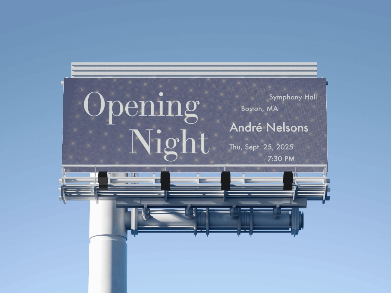
HIGHWAY BILLBOARD — OPENING NIGHT
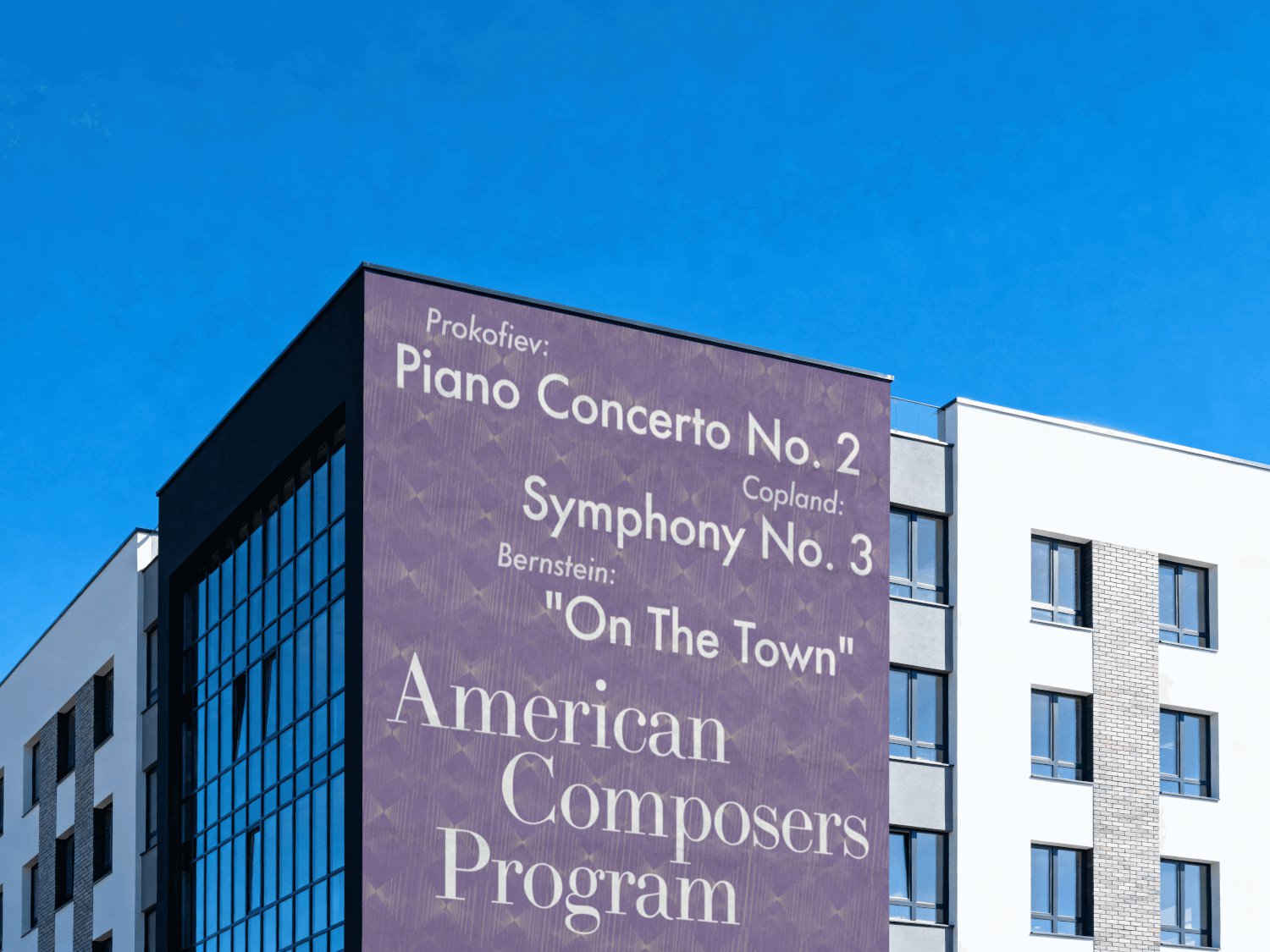
BUILDING WALL — AMERICAN COMPOSERS
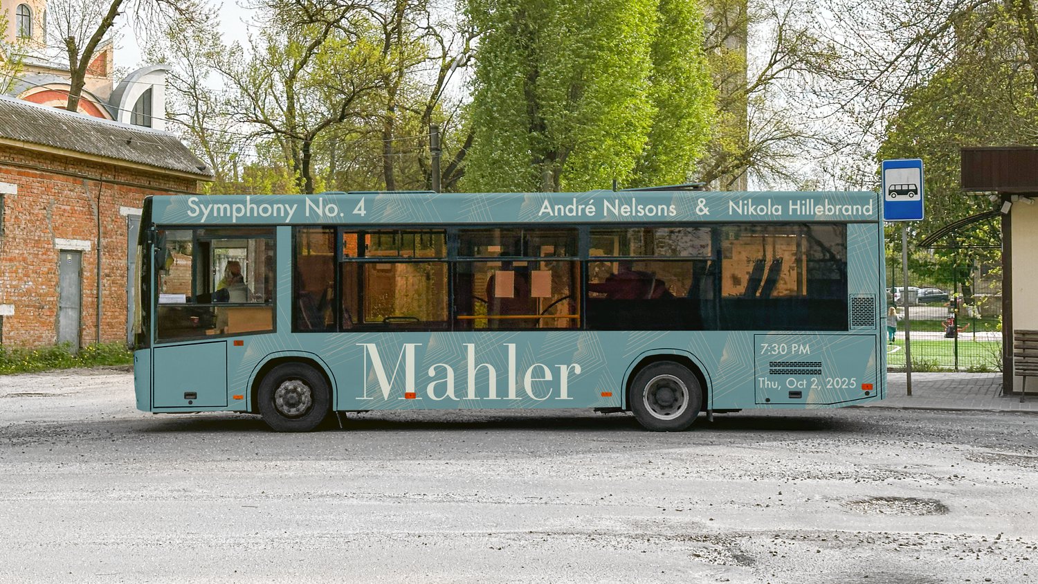
TRANSIT BUS WRAP — MAHLER
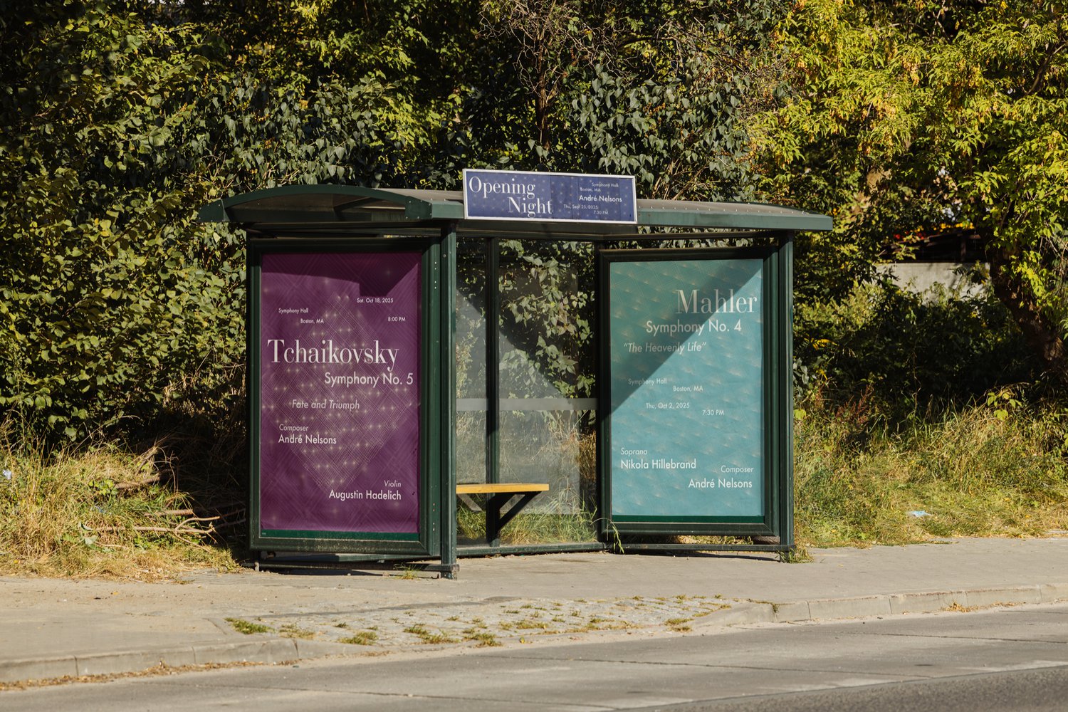
BUS SHELTER — THREE NIGHTS
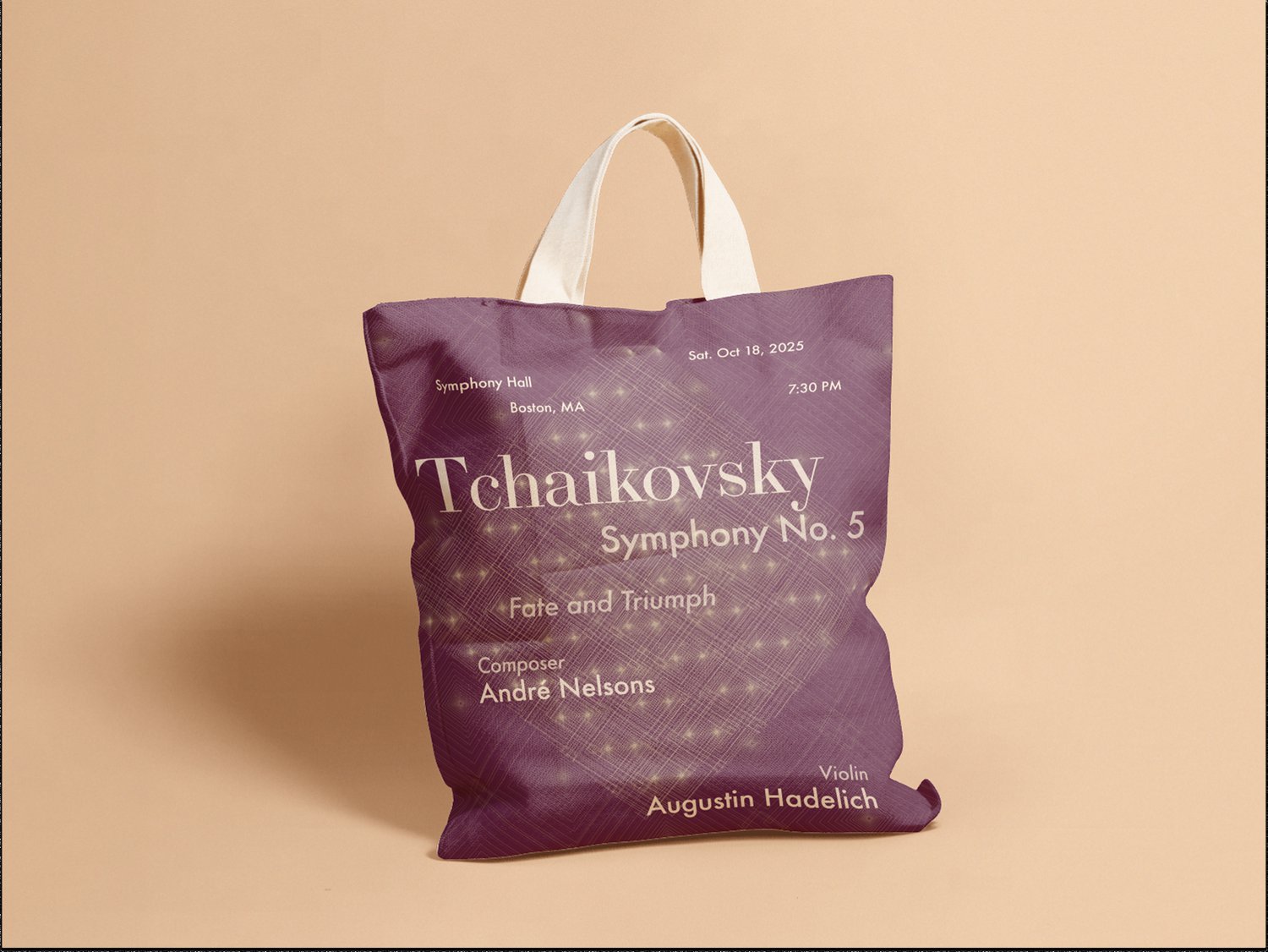
TOTE BAG — TCHAIKOVSKY MERCH
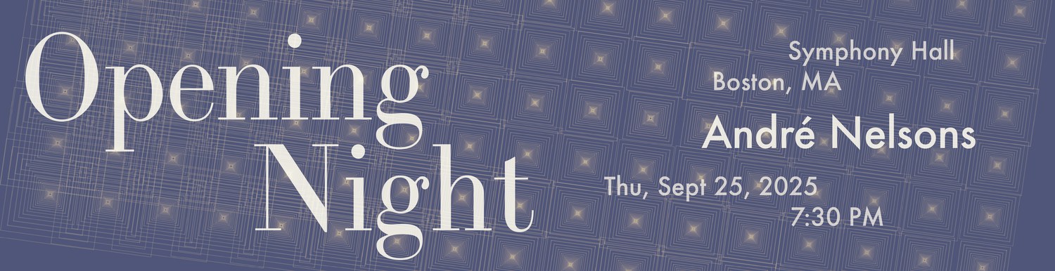
STREET BANNER — OPENING NIGHT
08 · WHAT I TOOK WITH ME
I stopped designing outcomes.
I went in thinking code wasn’t my medium. I came out with a mantra I now carry into every project: put your brainpower into the system, and the designing becomes play.
That lesson runs through everything I’ve built since — the 50-component design system I scaled at Generate, the prototype flows I’m testing at FirstGlance. Same discipline: design the rules well, and the artifacts almost make themselves.
It also sharpened how I think about AI. Anyone can ask a void for nine posters and get nine orphans back — scraped from everywhere, belonging nowhere. The interesting work is upstream: choosing the rules, deciding what the music controls, knowing where randomness should stop, recognizing when a system finally feels coherent.
Those aren’t things a tool decides. Those are design decisions.
The posters were never the point. The point is that somewhere between a blank p5.js template and a finished season of posters, I stopped designing outcomes and started designing the conditions for outcomes. I haven’t stopped since.
CASE STUDY NOTES
The Boston Symphony Orchestra poster system was built in p5.js and Adobe Illustrator for Todd Linker’s Algorithmic Graphic Design course at Northeastern University.