Anna Bartlett ▸ Civic / Service Design ▸ Esplanade Interactive Park Map
FOLDER 05 · OPENED
The Map Was Never the Problem
What a dead phone battery, a frozen water fountain, and a game of tic-tac-toe taught me about wayfinding.
01 · THE QUESTION
What happens when your phone dies?
Before this project, the Esplanade was just the green strip between the Charles River and Storrow Drive. I knew it as a running trail. I never thought of it as anything more than that.
Then a course called Experience Design Principles handed my team a public-sector design challenge, and I couldn’t stop unspooling questions: who actually runs this place? Who empties the trash bins? When a trending TikTok isn’t taking you to the docks for the sunset, how else do people hear about it? What is the park like for someone who doesn’t speak English?
And the question underneath all of them: what happens when your phone dies?
We assume nobody needs wayfinding anymore because the answers live in our pockets. But batteries die. Service drops. Tourists land without a US e-SIM. That’s the moment the built environment has to speak for itself — and I wanted to know what it was saying.
02 · FIELD RESEARCH
Learning to see a park.
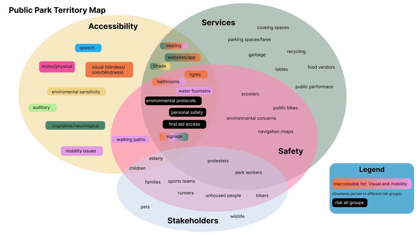
The course was built around field missions — weekly assignments that pushed us out of the classroom and into direct contact with people, services, and environments. Before we designed anything, we mapped stakeholders. Before we interviewed anyone, we practiced ethnographic observation. The structure enforced a discipline I’ve kept ever since: the work starts embarrassingly simple. Go outside and watch how people actually navigate, not how designers assume they do.
I pushed our team to study other parks first; if you want to understand wayfinding, start by observing the places where it already works. We visited Martin’s Park, Thomas M. Menino Park, and the Rose Kennedy Greenway. I noticed we kept gravitating to playgrounds, and eventually I understood why: playgrounds build community from the first step in. They’re the one public space designed with the full expectation that a stranger will walk up and immediately know how to engage.
The well-funded ones had something else in common: accessibility wasn’t a feature, it was the foundation. That observation started as a corner of our territory map and ended up as a pillar of the whole project.
03 · THE PATTERN
The interviews kept saying the same thing.
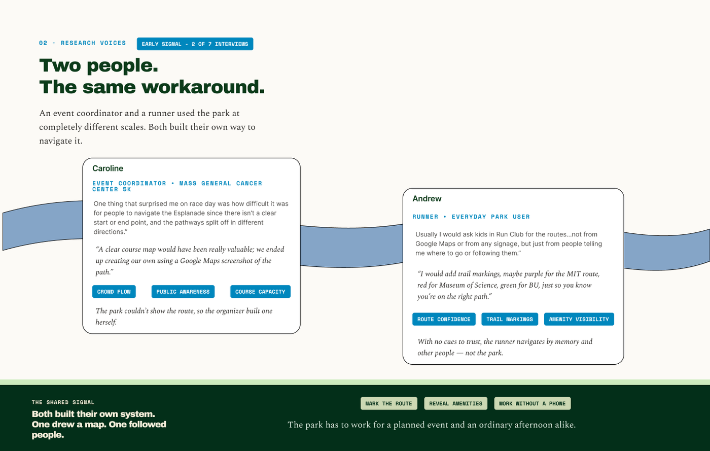
Each of us ran interviews; mine were with Caroline and Andrew, and they opened up the range of communities that rely on this park, from Mass General Cancer Center’s big events to Northeastern’s run club.
Then came the sensemaking. I led our class’s mini-method lab on affinity diagramming and experience journey synthesis the same week we clustered our own data into insights and tensions — teaching the method and applying it in the same breath. And when we mapped everything, every conversation converged on the same pattern: the people who navigate the Esplanade best have never used a map of it. They learned it by word of mouth, or they built their own mental map through repetition. Once you know Boston, the Charles River itself becomes an orienting device — the bridges are the connectors, and if you know where the bridges take you, you know where you are.
But here’s what that pattern hides. Knowing the layout doesn’t mean knowing the amenities.
I’m a runner. I had run past the Esplanade’s water fountains enough times to assume they were simply always on — until late October, when I discovered they’re shut off for the winter and don’t come back until mid-April. That fountain is functional five months a year. Is that on any map? No. Same with the bathrooms: the map shows you where one is, and then you arrive to find it under construction or closed.
The maps weren’t wrong about where things were. They were silent about whether those things worked. That’s the difference between a map of a park and a map for the people in it.
04 · THE INSIGHT
The tic-tac-toe moment.
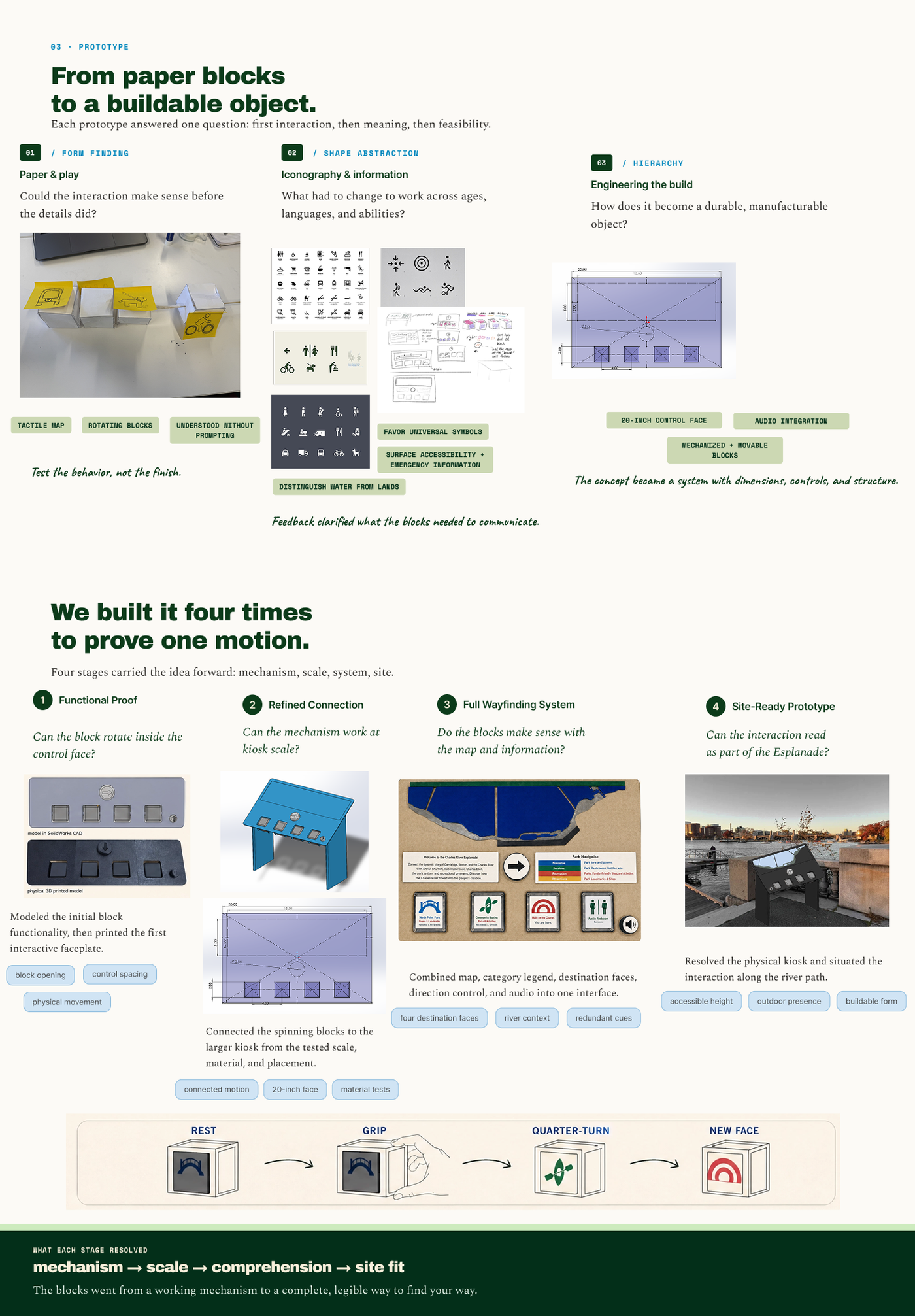
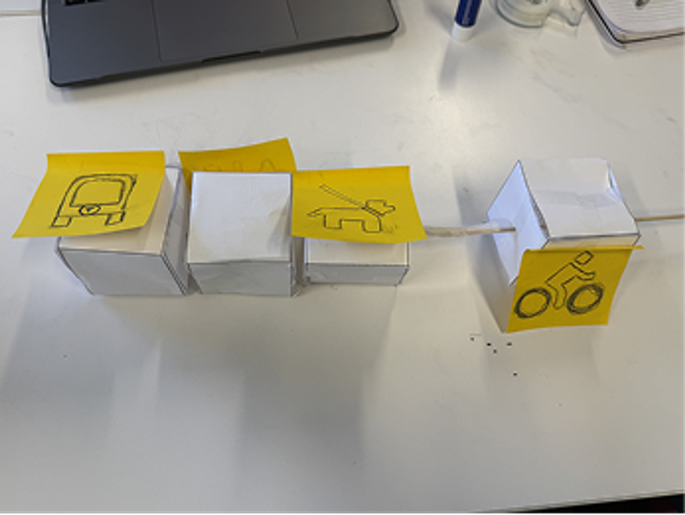
At Martin’s Park, watching kids play, I found myself drawn to the rotating tic-tac-toe cubes — and I mean personally drawn. I didn’t hesitate. I didn’t decide. I just started playing.
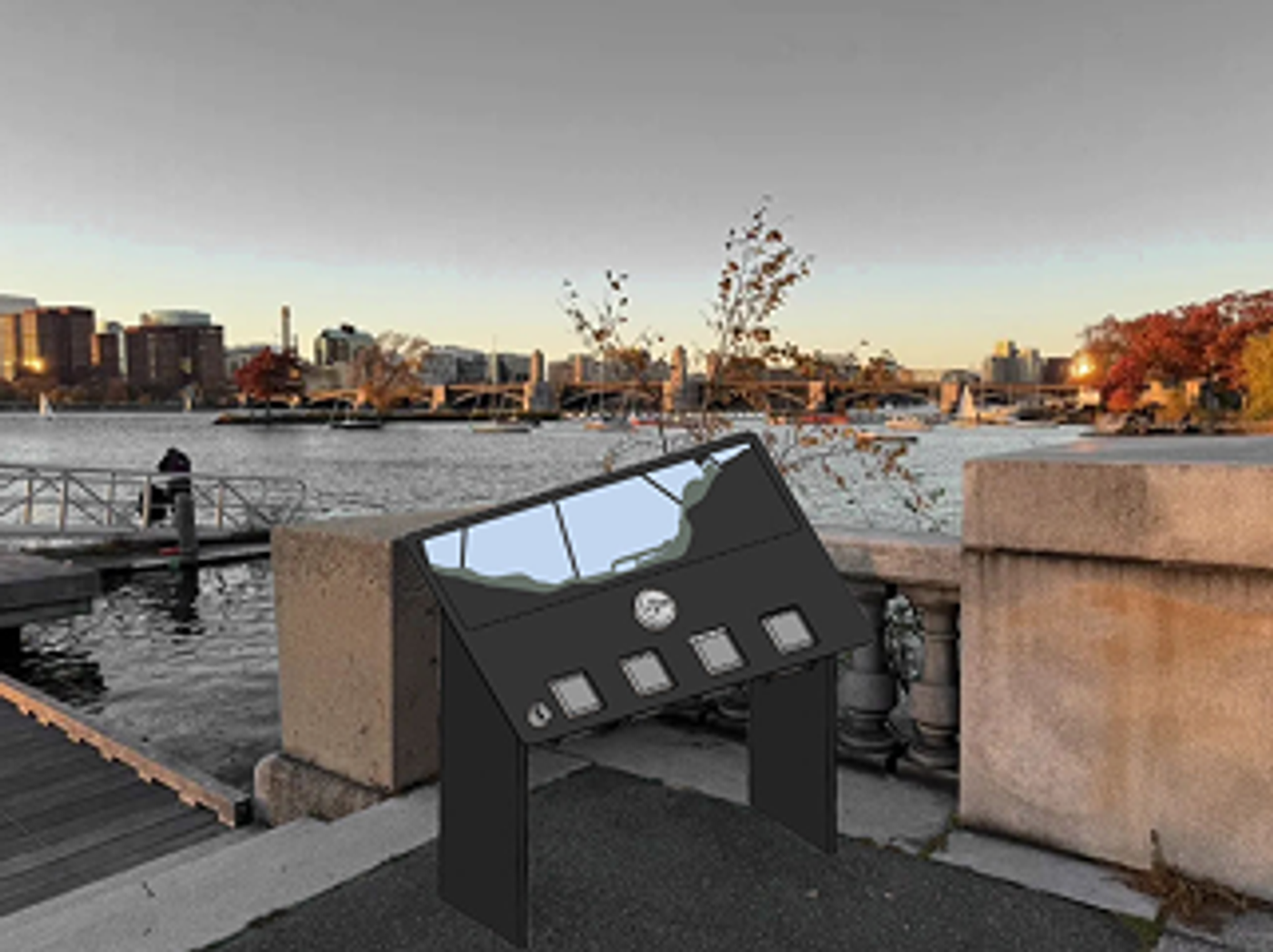
I took that moment back to my team, because we’d been circling the idea of a tactile installation and this was the evidence: the same pull that gets a kid to spin a block could get a commuter to look up from their phone. No screens. Just curiosity, and maybe, on your hundredth walk home along the Esplanade, learning something about the route you never knew.
That’s when the project came to life. Our final product needed the element of play.
The course pacing mattered here more than I appreciated at the time: lo-fi prototyping came after five weeks of observation, interviews, and synthesis. By the time we sketched our first paper blocks, the tic-tac-toe moment wasn’t a cute anecdote — it was a validated behavioral insight with field notes behind it.
05 · THE CONSTRAINT
Four sides, on purpose.
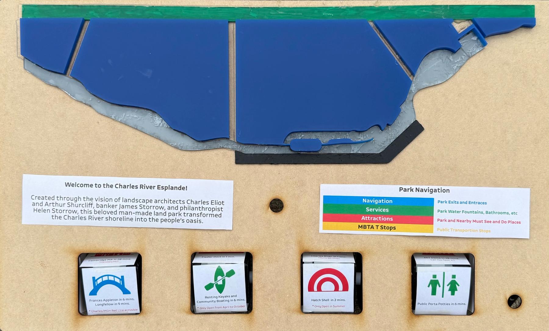
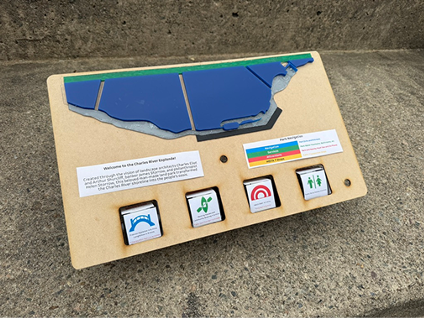
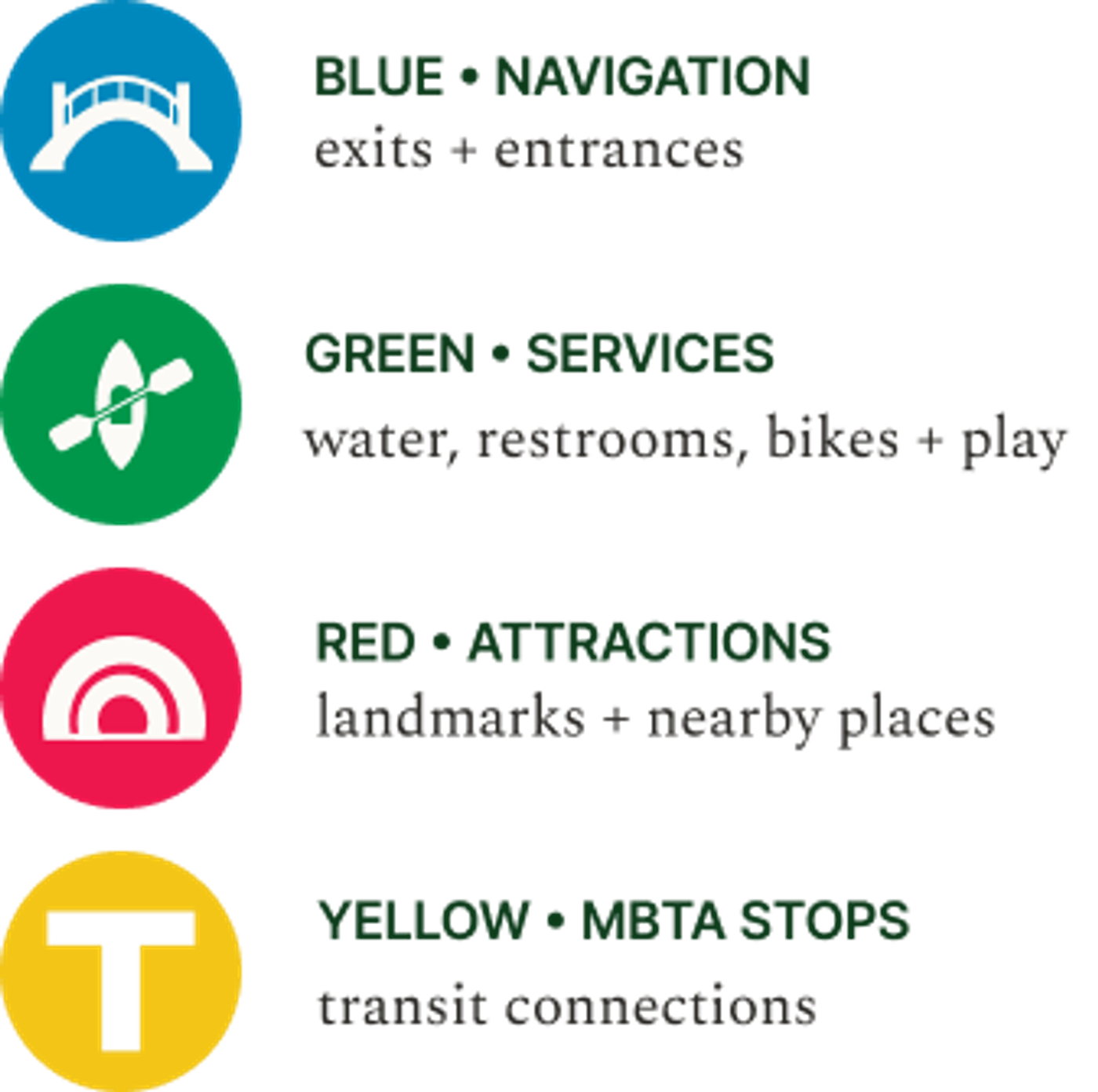
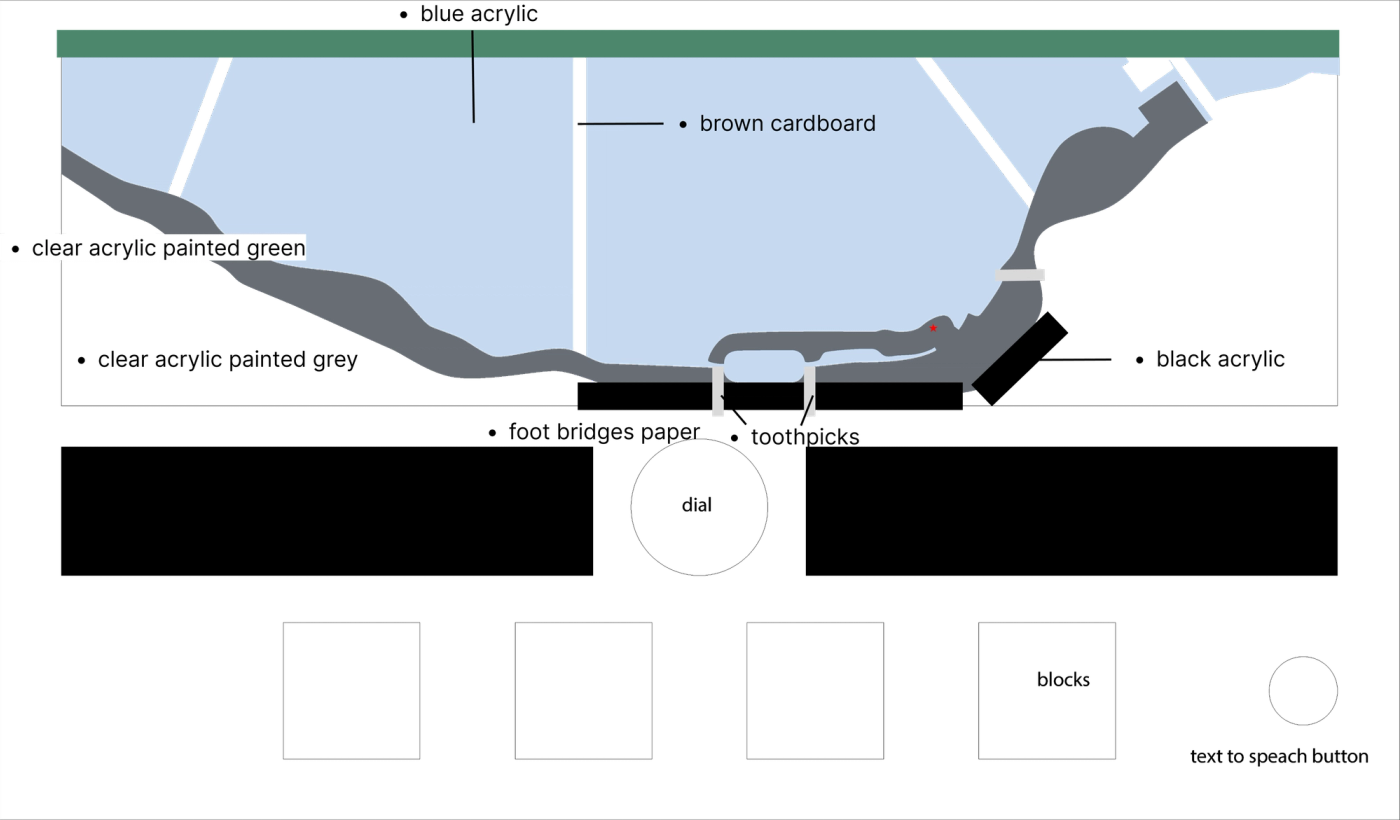
The rotating block gave us more than charm; it gave us parameters. Four sides per block, one for each of the four wayfinding categories our research had narrowed to. After a few turns, you’ve seen everything the installation has to say.
That constraint was a deliberate ethical choice. We weren’t trying to gamify the park and hold people for a prolonged time — the opposite. Let curiosity carry you to exactly what you need, then release you back to the park. The interaction should end. Screens are designed to keep you; a good public installation lets you go.
And a physical block does something no screen ever will: you can touch it. For visitors with visual impairments, cognitive differences, or anyone overwhelmed by glowing interfaces, touch is not a nice-to-have. It’s the whole interface.
06 · THE REAL PROBLEM
Accessibility wasn’t a constraint. It was the design.
Here’s the thesis the research forced on us: the problem was never how many maps the Esplanade had, or where they were posted.
The problem was that the interaction with the map excluded the people who needed it most — visitors with visual, auditory, mobility, cognitive, or speech-related needs, people with environmental sensitivities, people whose phones were dead, people who don’t speak English.
And when we designed for those visitors first, something quietly wonderful happened: everyone else benefited too. Children were drawn to the same play a commuter was drawn to. The tourist and the daily runner got the same small gift — reaching for a direction and coming away with a new fact about the park, or a better sense of how far you are from home.
07 · MY HANDS ON IT
What I owned, and what the team taught me.
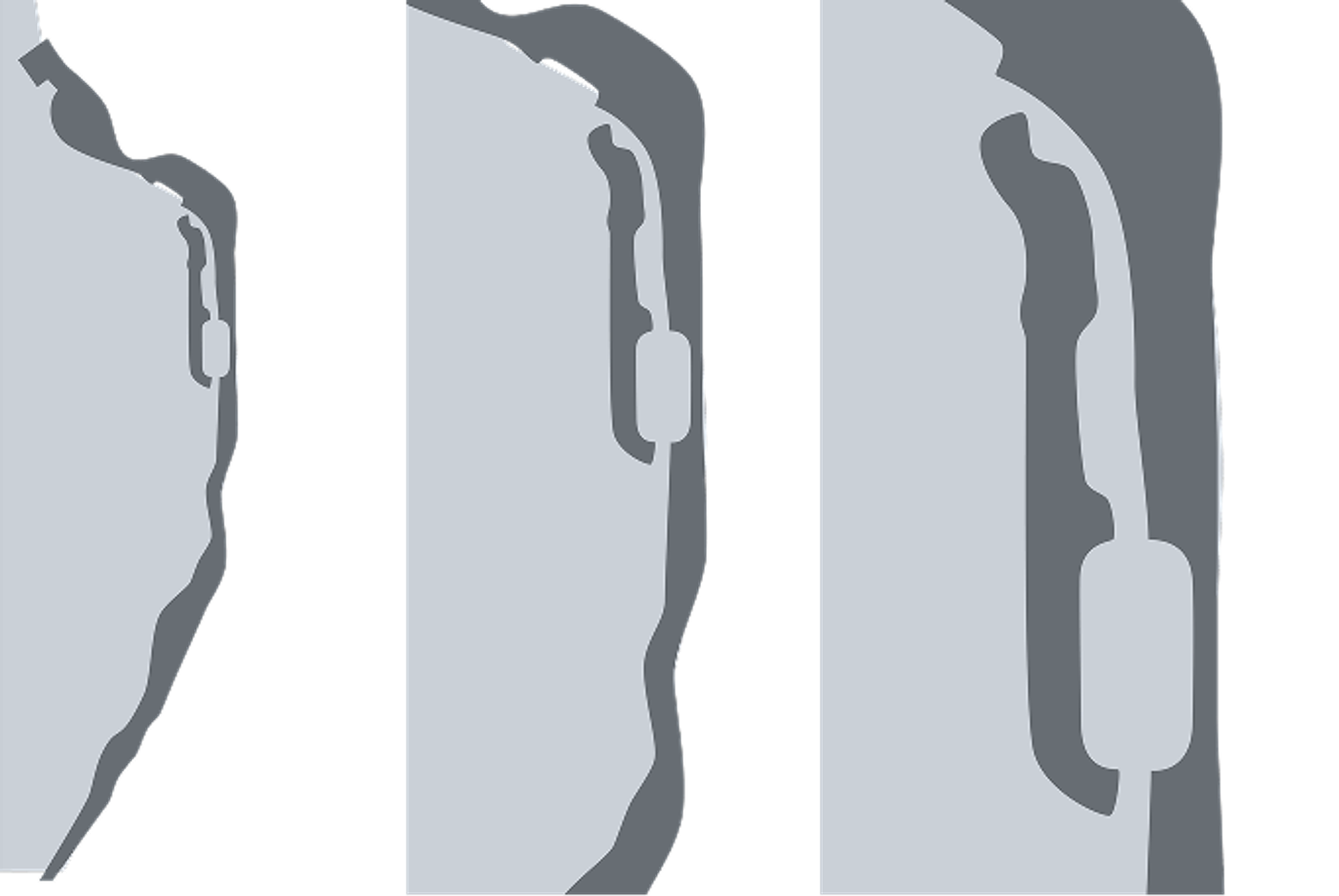
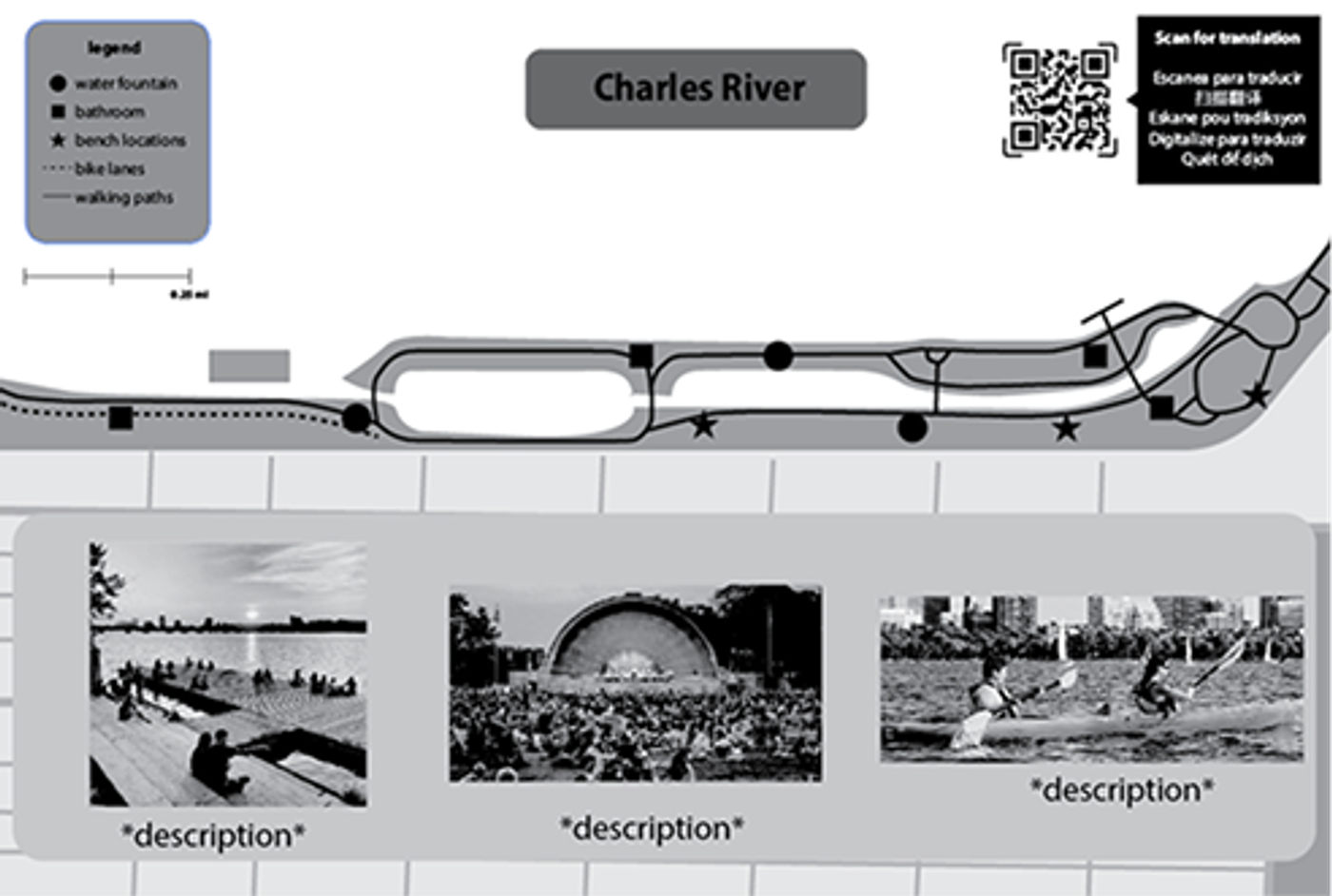
My fingerprints on this project: the map itself, designed in Illustrator, including the scale problem. The Esplanade is a small, famous sliver of the Charles River greenery, and orienting people meant deciding how much of the surrounding city to show. Zoom too close and you lose the bridges; too far and you lose the park.
But the prototype exists because of my teammates. Gia (computer science + design) brought laser-cutting experience; Charlene (mechanical engineering + design) jumped into CAD mockups with an enthusiasm I’ll never forget. My Illustrator files became cut wood and acrylic — watching my flat designs become an object you could hold changed how I see my own abilities as a designer.
Honest note: collaboration wasn’t frictionless. Creatives work at different speeds and excel at different stages, and communication is what got us through the bumpy patches. The course also demanded external validation — one field mission required testing insights with at least two stakeholders beyond the classroom. So I cold-DM’d the Charles River Conservancy and Boston parenting accounts: the Conservancy responded enthusiastically and invited questions; my follow-up about installation placement, sent once our laser-cut prototype made the idea concrete, went unanswered. Real research includes the emails nobody returns.

08 · WHAT I TOOK WITH ME
A reason to look up.
This project rewired how I start design work: before you design the intervention, watch the world work without it. The runners with mental maps, the frozen fountains, the kid spinning a cube — none of that shows up in a brainstorm. You have to go stand in the park.
It also gave me my working definition of accessible design: not a checklist you apply at the end, but the starting perspective that makes the whole thing better for everyone. I’ve carried that into every project since — it’s why my later work keeps asking who gets left out of an interface before asking what the interface should look like.
And it planted a conviction that’s become something of a compass: the most interesting design problems aren’t about adding information. They’re about making the information that already exists reachable — for the person whose phone is dead, whose eyes work differently, who’s new to the country, who’s just looking up for once.
The Esplanade already had maps. What it needed was a reason to look up.
CASE STUDY NOTES
The Esplanade Interactive Park Map was a team project with Gia Violini and Charlene Lam for Sofía Bosch Gómez’s Experience Design Principles course (ARTG 3462) at Northeastern University — a semester of stakeholder mapping, field missions, co-design methods, and iterative prototyping in Adobe Illustrator, CAD, and laser-cut wood and acrylic.