Anna BartlettStructural InequalityBoston Mobility Tapestry

FOLDER 01 · OPENED

Boston Mobility Tapestry

An experiment in data physicalization.
ROLE Designer & ResearcherTIMELINE Spring 2026 · ARTG 5000TEAM Individual · NEU Art + Design
Boston Mobility Tapestry — cover

01 · THE PATTERN

Where you’re born shapes what you’ll earn.

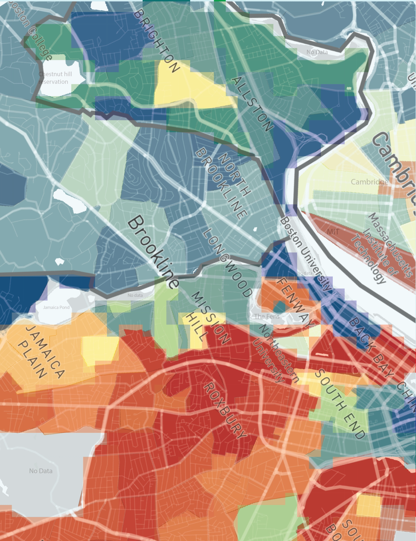
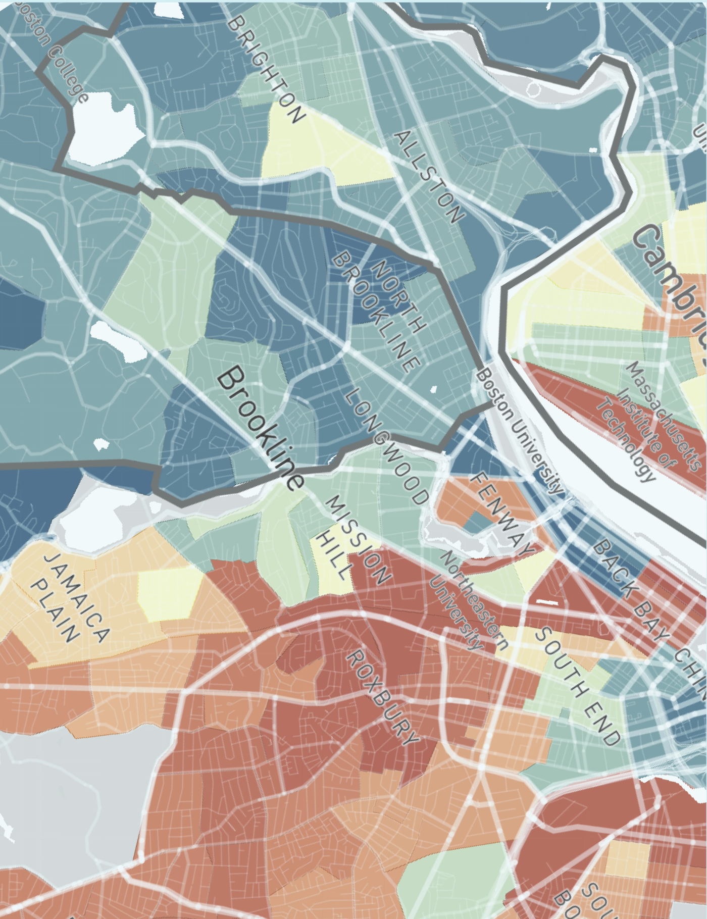
The Opportunity Atlas traces the income of adults back to the neighborhood they grew up in. Cambridge and Brookline children reach median incomes above $400,000; children raised in Roxbury and Mission Hill — a 15-minute drive away — reach about $12,000. Not a rule with exceptions. A geography of probability.

The warp is fixed, the structure is given. That’s not a metaphor for generational wealth. That is generational wealth.
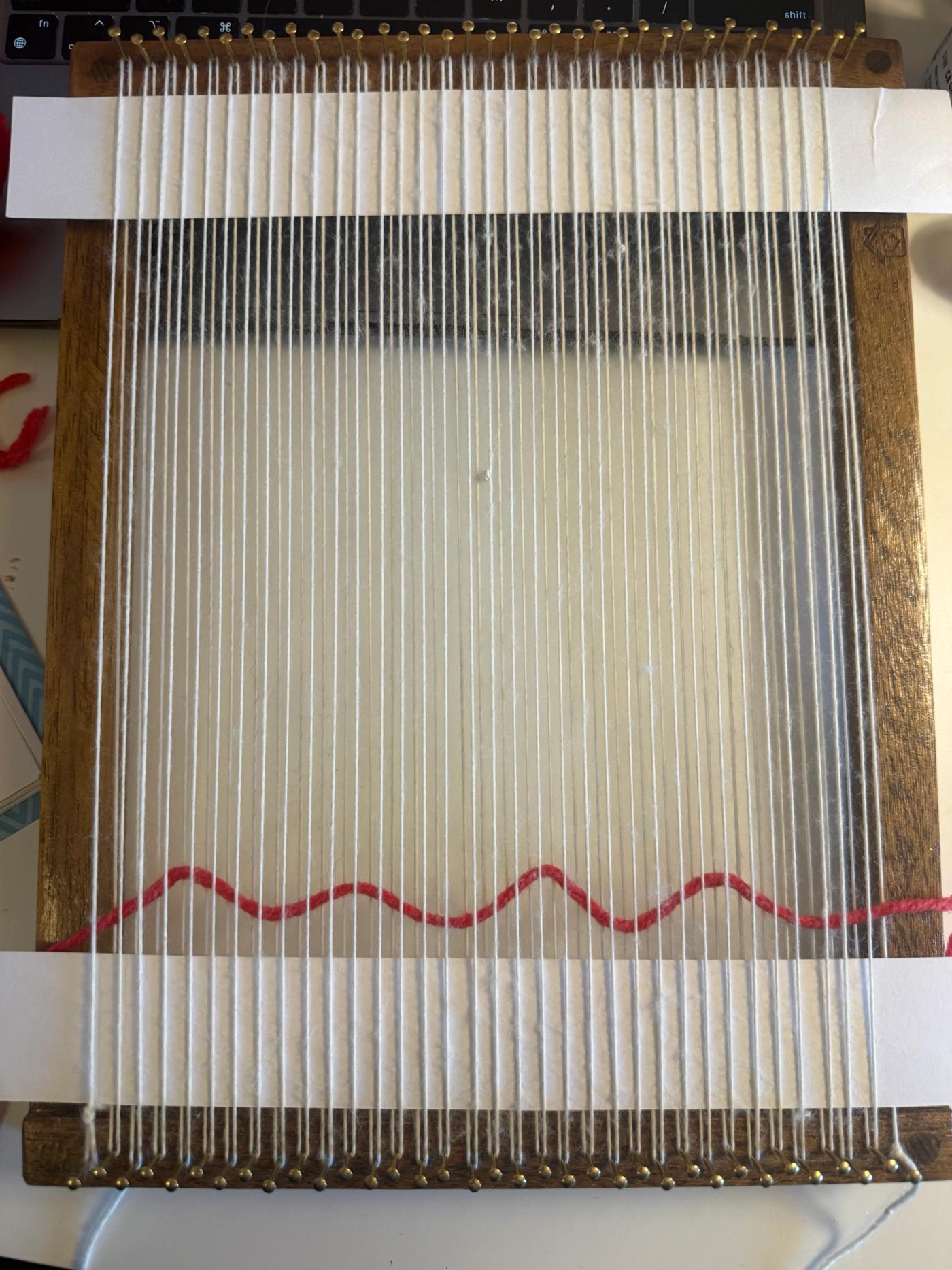
A bare weaving loom strung with white warp threads, a single red line woven across the lower third — the structure set before any pattern begins.
The warp is fixed before the first row is woven. The structure is set before you arrive.
An Opportunity Atlas map of Boston with neighbourhood names, shaded blue through red: Brookline, Cambridge and Allston in cool blues, Roxbury, Mission Hill and the South End in deep reds.
The Opportunity Atlas over Boston: Brookline and Cambridge in blue, Roxbury and Mission Hill in red. A geography of probability.

02 · THE SYSTEM

Every decision is a data point.

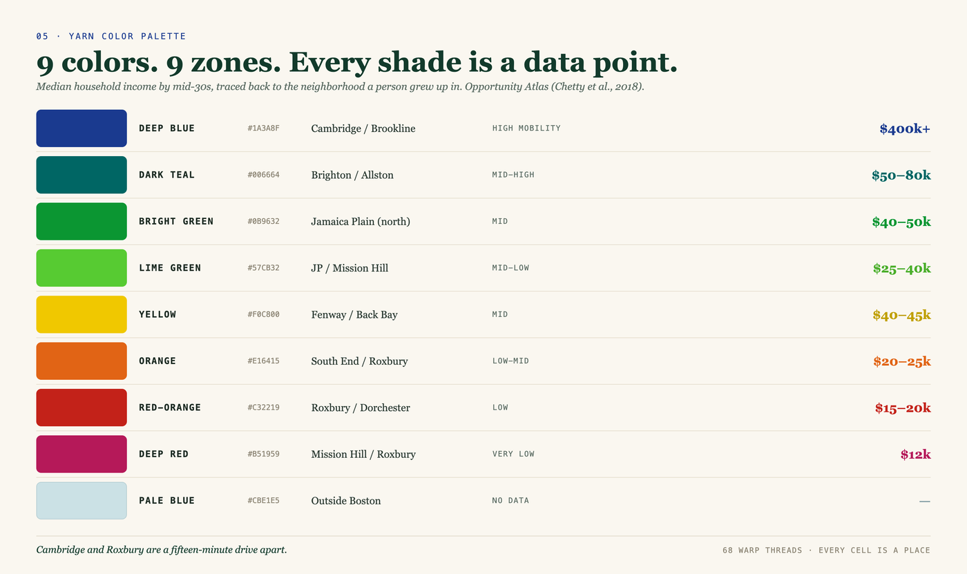
The tapestry was designed as a system first. Each layer of Bronfenbrenner’s ecological systems theory maps to a specific weaving element — the warp encodes structural history, color fills encode income tiers, boundary techniques encode how inequality transitions between zones, and individual knots encode lived texture. Nothing is decorative.

The math was right. But the problem was never really mathematical.
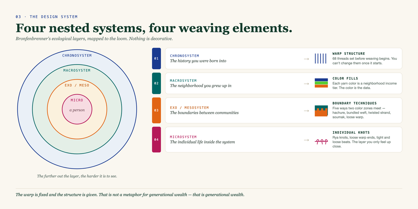
A diagram pairing four concentric circles with four weaving elements. Chronosystem, the history you were born into, maps to warp structure: 68 threads set before weaving begins. Macrosystem, the neighborhood you grew up in, maps to colour fills, where each yarn colour is an income tier. Exo and mesosystem, the boundaries between communities, maps to five boundary techniques. Microsystem, the individual life inside the system, maps to individual knots.
Four nested systems, four weaving elements — Bronfenbrenner’s ecological layers mapped to warp, colour, boundary and knot.
A nine-row colour key. Deep blue #1A3A8F, Cambridge and Brookline, high mobility, $400k+. Dark teal, Brighton and Allston, $50–80k. Bright green, north Jamaica Plain, $40–50k. Lime green, JP and Mission Hill, $25–40k. Yellow, Fenway and Back Bay, $40–45k. Orange, South End and Roxbury, $20–25k. Red-orange, Roxbury and Dorchester, $15–20k. Deep red, Mission Hill and Roxbury, $12k. Pale blue, outside Boston, no data.
9 colors. 9 zones. Every shade is a data point.
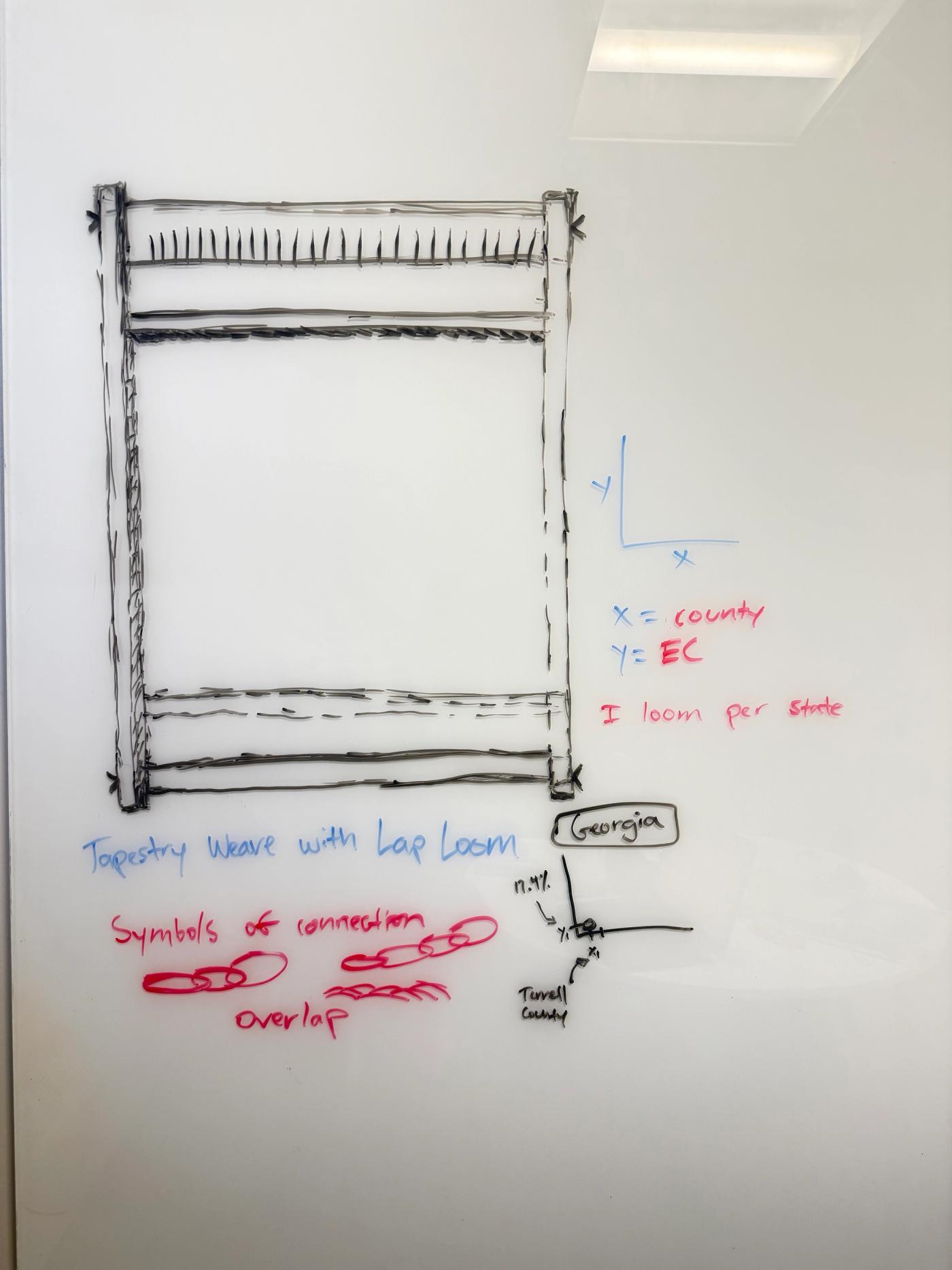
A whiteboard sketch working out the weaving system — a loom drawn in black marker with handwritten notes on axes, comparison and overlap.
Working out the encoding system — what the warp holds fixed, and how one loom carries the comparison.

03 · THE TRANSLATION

From a screenshot to a weaving map.

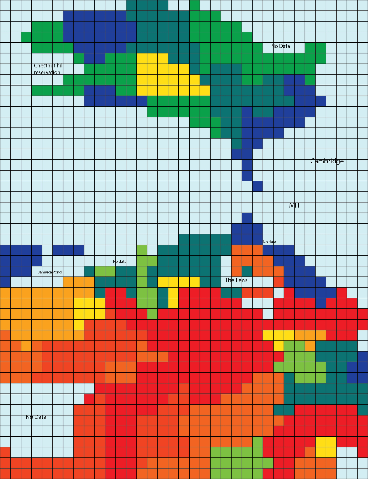
A screenshot of Boston from the Opportunity Atlas was translated into a 68-column pixel grid in Illustrator — each column a warp thread, each row a weft pass, each cell a color decision. Then the grid was placed back on the map to verify: every stitch is geographically located.

Every cell is a place. Every color is a data point. Every stitch is a neighborhood.
The Opportunity Atlas map of Boston with a pixel grid overlaid, showing how map areas align to individual cells.
The grid placed back over the Atlas to verify: every stitch is geographically located.
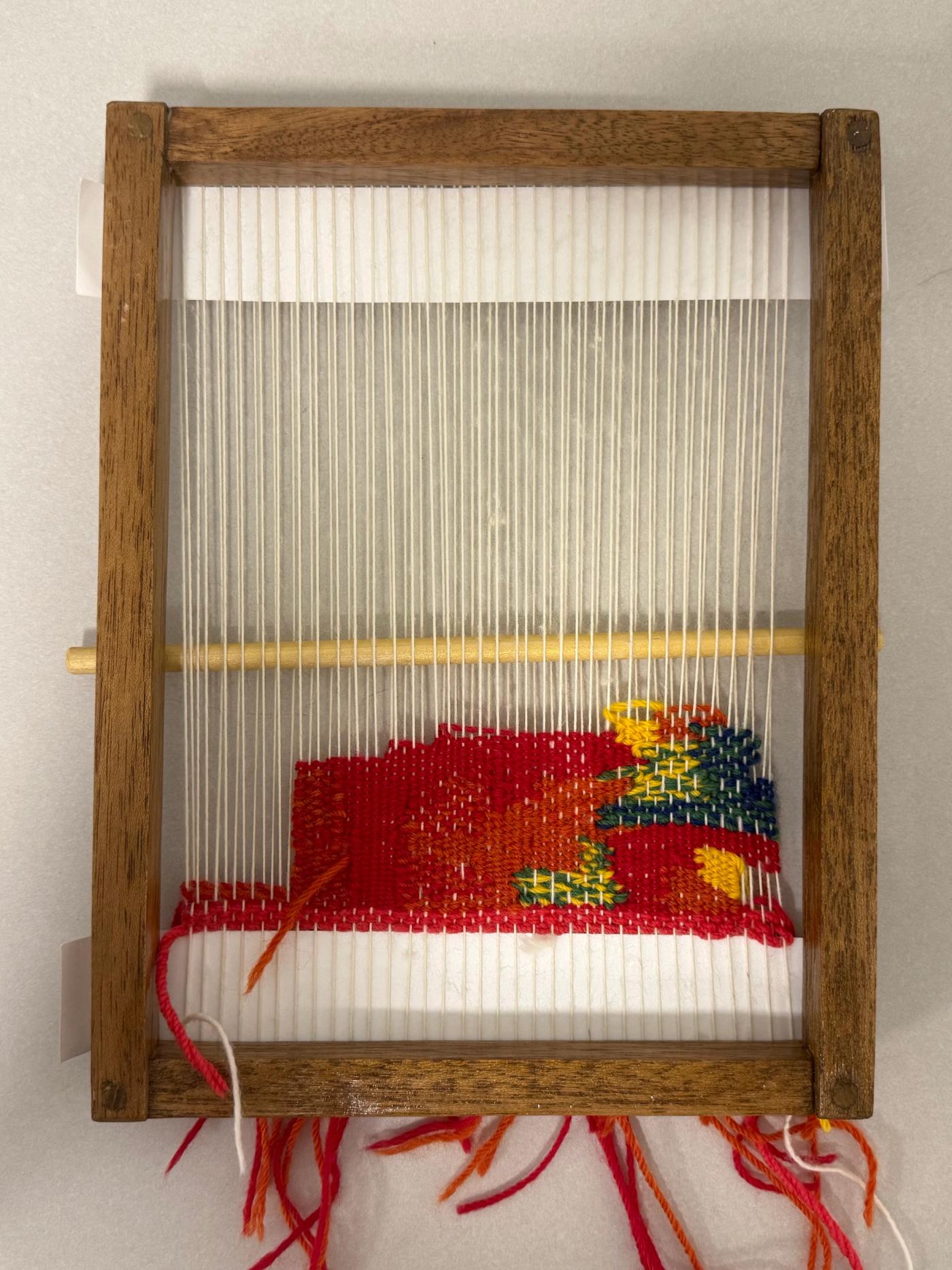
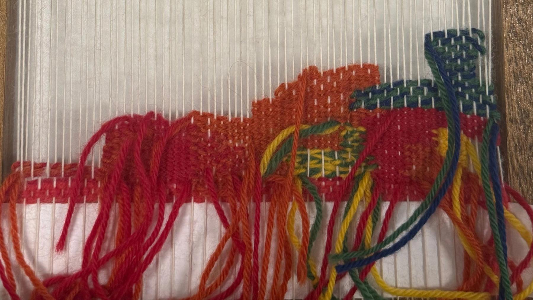
A wooden hand loom with the tapestry partly woven — bands of red, orange, yellow, green and blue across white warp threads, loose yarn ends hanging.
On the loom — the tapestry in progress.
A 68-column colour grid of Boston rendered as pixels, labelled with Cambridge, MIT, The Fens, Jamaica Pond and Chestnut Hill Reservation, greens and blues in the north, reds and oranges through the south.
The 68-column grid — each column a warp thread, each row a weft pass, each cell a color decision.

04 · WHAT I LEARNED

Unfinished. But the system exists now.

The goal was never to finish the tapestry — it was to define a system rigorous enough that every stitch is a data point. That system exists. What the weaving taught me couldn’t have come from a chart: that inequality has a texture, that the structure is set before you arrive, and that making something with your hands changes what you’re willing to ignore. This is the work I want to keep doing — research and design in service of civic and social systems, where the goal isn’t to solve the question but to make it impossible to ignore.
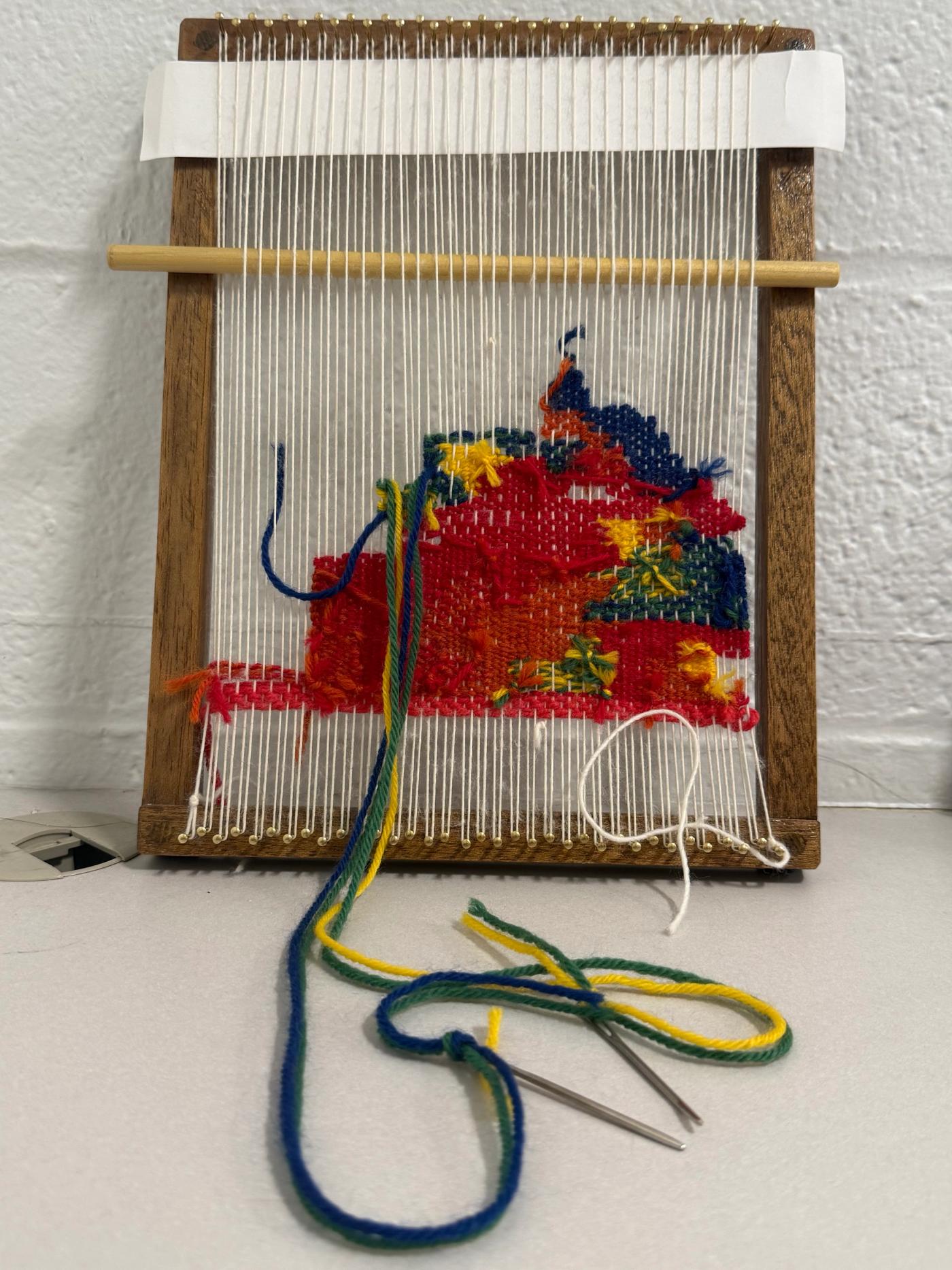
The tapestry on its loom seen straight on, the woven block of red, yellow, blue and green sitting in the lower half against unwoven white warp.
The woven block against the unwoven warp.
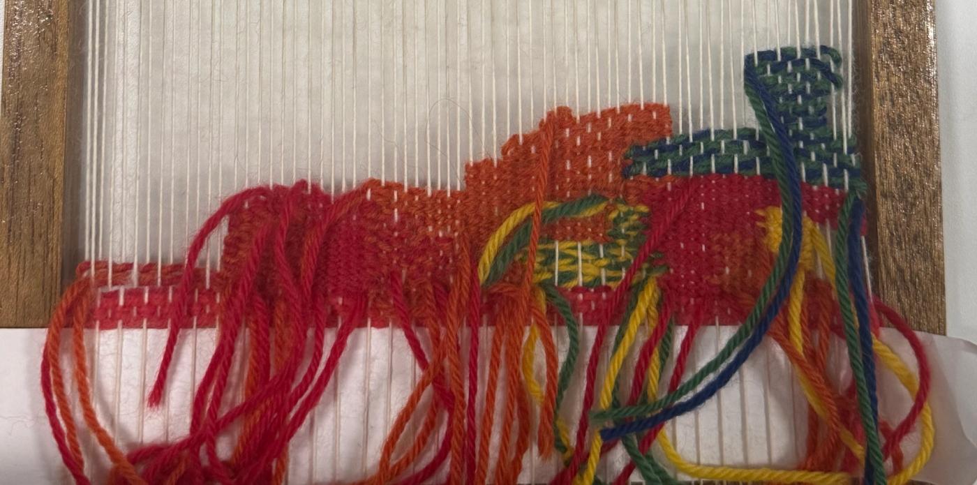
A close detail of the weave, thick red and orange yarn ends with blue and yellow knots, the texture of individual stitches visible.
Detail of the weave — the texture a chart could not have shown.

CASE STUDY NOTES

A data-physicalization experiment (ARTG 5000, NEU Art + Design, Spring 2026) grounded in the Opportunity Atlas and Bronfenbrenner’s ecological systems theory. Unfinished by circumstance but complete by intent — the goal was to define the system, not finish the cloth. Proof of direction toward civic and social research design.