Anna Bartlett ▸ Anxiety ▸ Anosity
FOLDER 02 · OPENED
Anosity
Making an invisible system visible — one anxious pattern at a time.
01 · WHAT EVERYONE SEES
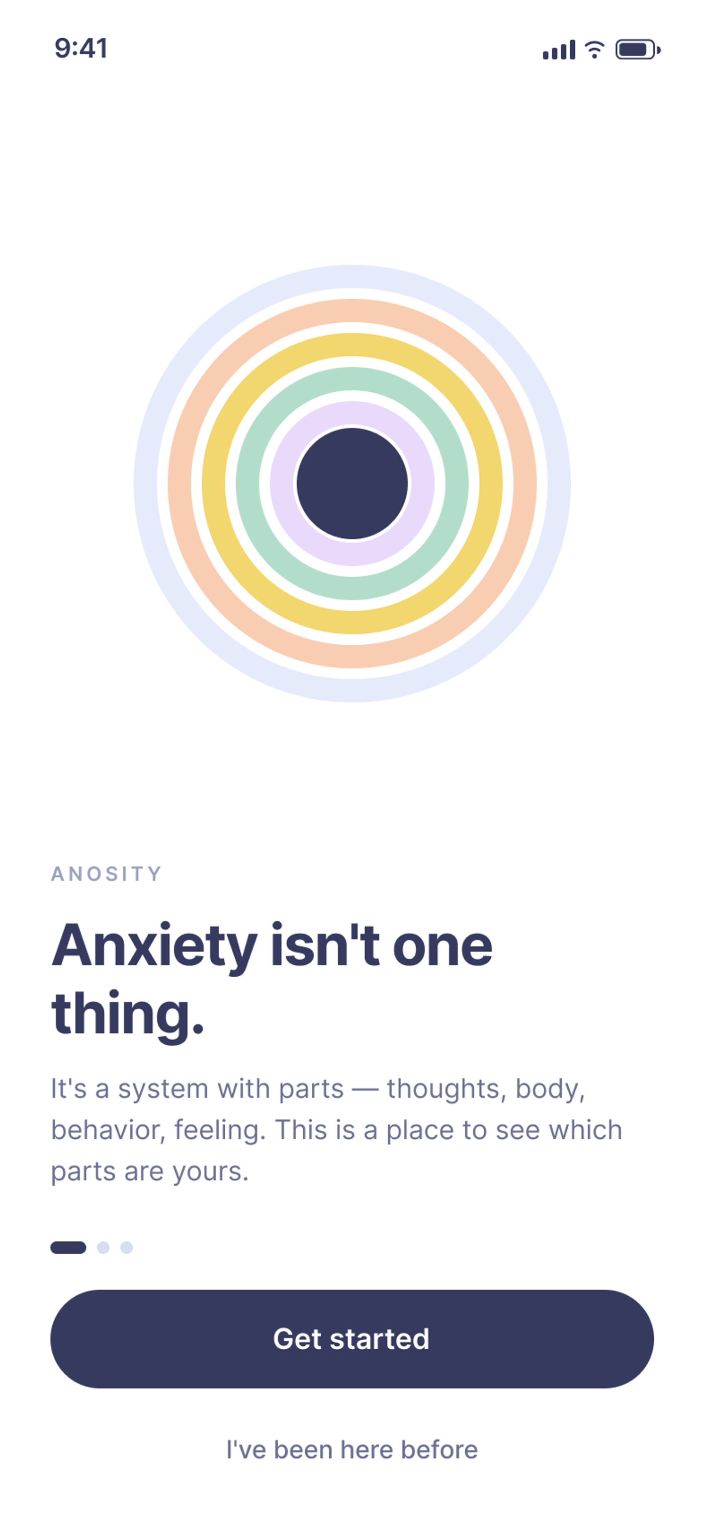
Anxiety looks like one thing. It isn't.
A tight chest. A racing mind. A bad day. We say “I'm so anxious right now” the way we'd report the weather — one word for a whole sky.
So we treat it like one thing, too. We try to make it stop. We download an app that tells us to breathe, rate our mood from one to five, and watch a line go up or down. The feeling gets a score. The score gets a color. Usually red.
And underneath all of it, for a lot of people, runs a quieter sentence:
Other people handle this. Why can't I?
That sentence is the part no app was measuring.
02 · WHAT I STARTED NOTICING
It didn't look like feeling too much. It looked like seeing too little.
I came into my Design and Mental Health course expecting to design something calming. A softer breathing app. A gentler tracker.
But the more I read, the less the problem looked like feeling too much. It looked like seeing too little.
The people the research kept describing weren't falling apart. They were high-functioning. They showed up, performed, achieved — and privately filed their anxiety under personality. Not “I have anxiety,” but “I'm just like this.” A flaw to manage, not a pattern to understand.
The stigma research had a name for the trap: weak-not-sick. If you're not visibly broken, your anxiety doesn't count as real — so you don't name it, don't explore it, and definitely don't get curious about it. You just push through and assume the problem is you.
That's when the project turned for me.
I wasn't designing another mood tracker. I was designing a way to see the system underneath the feeling.
03 · THE HIDDEN PATTERN
Anxiety is not one thing. It's a system.
Here's the thing the science made impossible to unsee. The neurobiology breaks anxiety into domains that are always running at once, always feeding each other:
- Thoughts — worry loops, the mind going blank
- Physical sensations — a clenched jaw, a sprinting heart
- Behaviors — procrastinating, over-preparing, avoiding
- Emotions — fear, dread, overwhelm
And around all of it: environment — the deadline, the group project, the room.
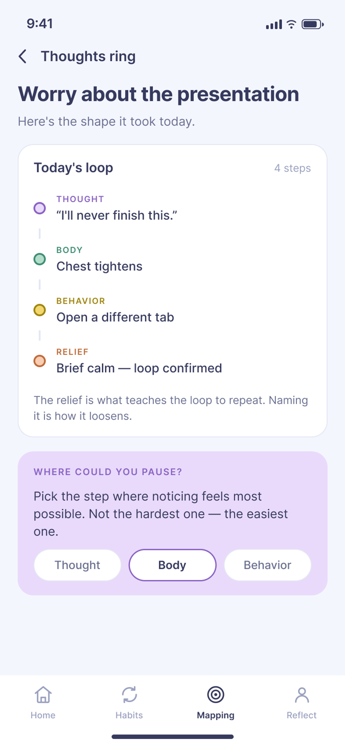
These aren't symptoms on a checklist. They're nodes in a loop. The thought tightens the chest; the tight chest reads as danger; the danger reroutes the behavior; the behavior confirms the fear. Round and round, fast enough that it feels like a single sensation. Fast enough to feel like you.
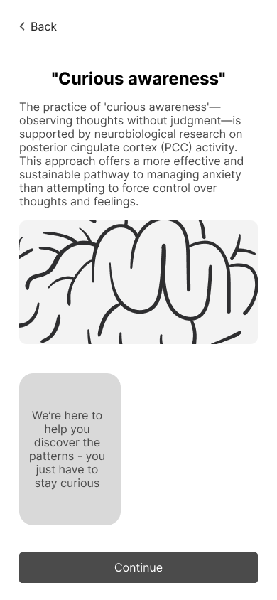
Then I found the move that changes everything — Judson Brewer's work on curious awareness. His research shows that non-judgmental observation can interrupt a habit loop. Not by fighting it. By noticing it. Curiosity and anxiety can't fully occupy the brain at the same time; the moment you get genuinely interested in what's happening, the automatic pattern loosens its grip.
Anxiety, it turns out, isn't a defect. It's a learned response trying to keep you safe — just doing it badly, in the wrong moments.
Anxiety became less of a label and more of a pattern I could observe.
That reframe became the whole design problem. Not how do we calm people down, but how do we help them see the loop while they're inside it?
A VISUAL SPARK · LONDON
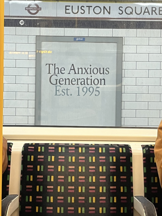
Making an invisible experience hard to ignore.
While living in London, I kept seeing The Anxious Generation: Est. 1995 displayed across the city. I had not read the book and did not use it as research; what stayed with me was the campaign’s repetition and blunt public presence. It made an often-private subject feel visible in shared space.
The influence was communication, not content: name the tension directly, then give people a gentler way in.
BEFORE THE WIREFRAMES · MAPPING THE PROBLEM
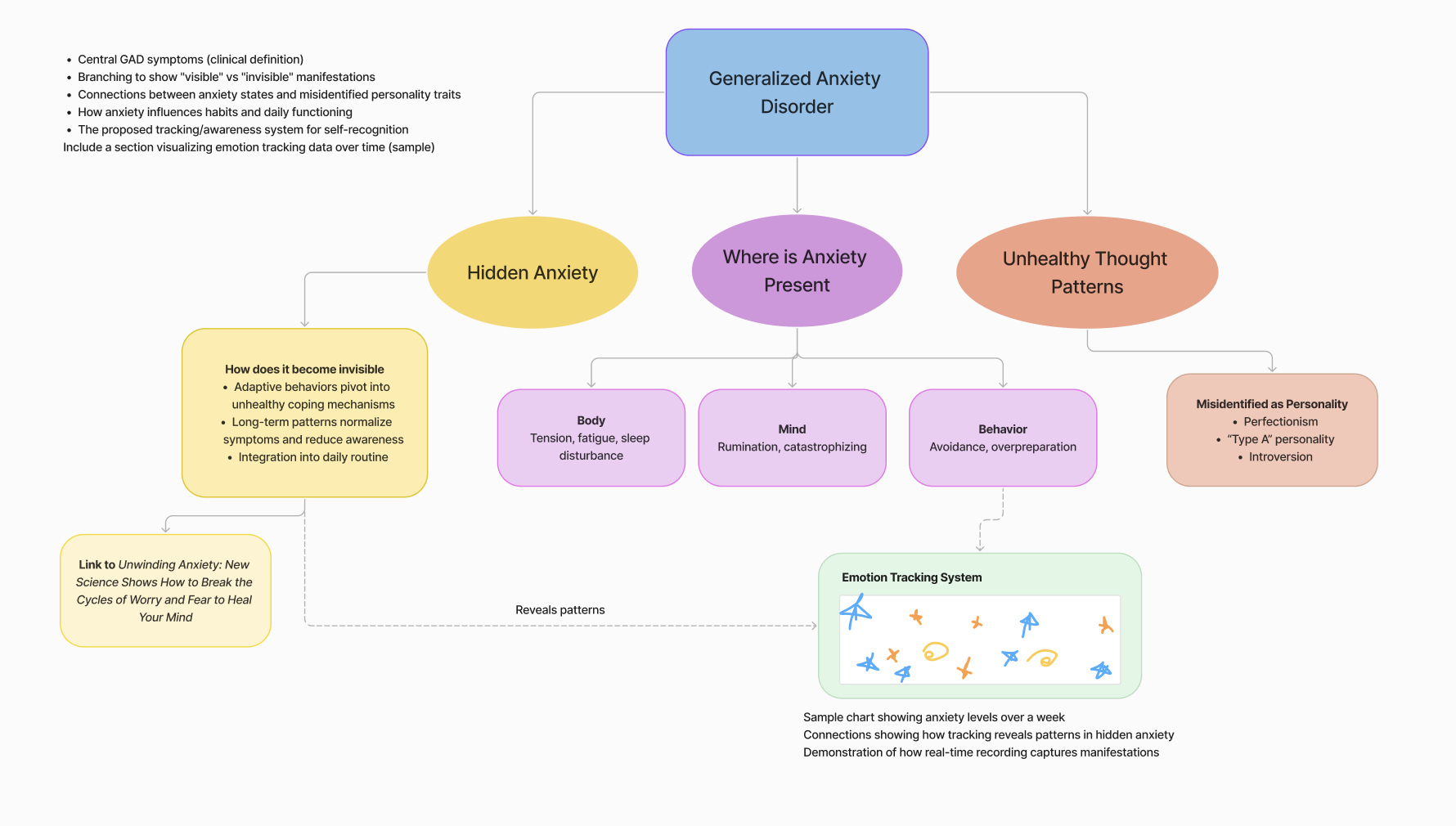
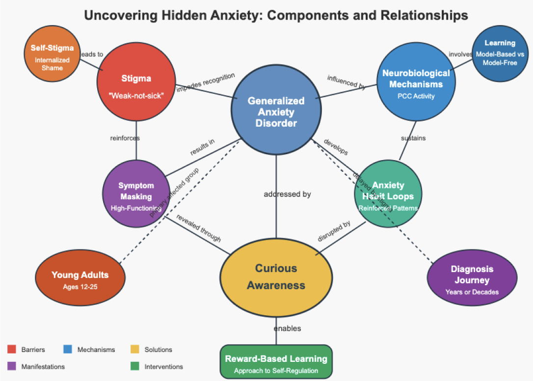
First I mapped the tangle, then I looked for the pattern.
The earliest work wasn’t screens. It was trying to see the whole system — where hidden anxiety lives across body, mind, and behavior, and where a gentler, noticing-based intervention could sit.
EARLY LO-FIS · FINDING THE ENTRY POINT
Before adding features, I tested how the experience should begin.
The first wireframes weren’t about visual polish. They tested how much context Anosity should provide, what users should control, and how the product could invite reflection without feeling like another assessment or performance dashboard.
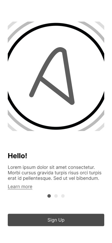
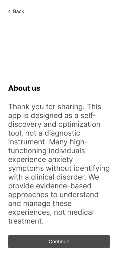
01 / TRUST
Explain before asking.
Early onboarding introduced Anosity as a reflective guide before asking the user to track anything. The entry needed to establish purpose, expectations, and control before requesting personal input.
PURPOSE BEFORE DISCLOSURE
02 / AGENCY
Let the user choose what to notice.
The first flows explored a personalized starting point rather than one fixed assessment. Users could choose the areas they wanted to understand, so the experience felt relevant instead of like a verdict.
CHOICE OVER COMPLETENESS
03 / HIERARCHY
Design one calm next step.
The home studies tested how much to show at once. The direction sharpened as one primary check-in gained emphasis and trends, resources, and secondary tools moved into supporting roles.
ONE ACTION BEFORE MANY INSIGHTS
01 · ENTRY & ONBOARDING
02 · CHOOSING WHAT TO NOTICE
03 · FROM MANY MODULES TO ONE ACTION
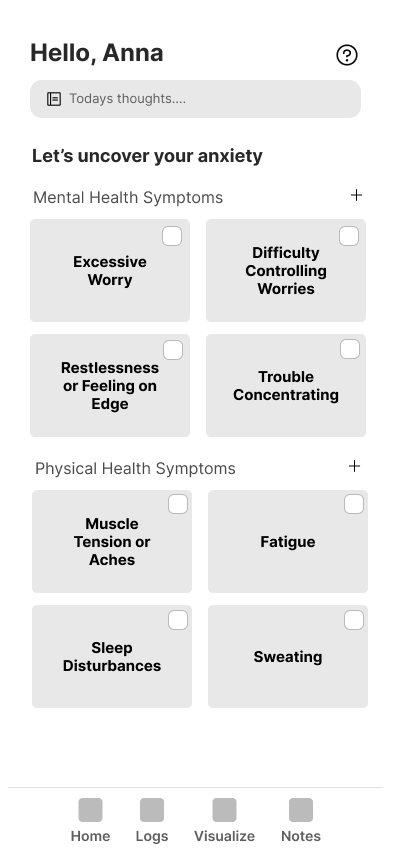
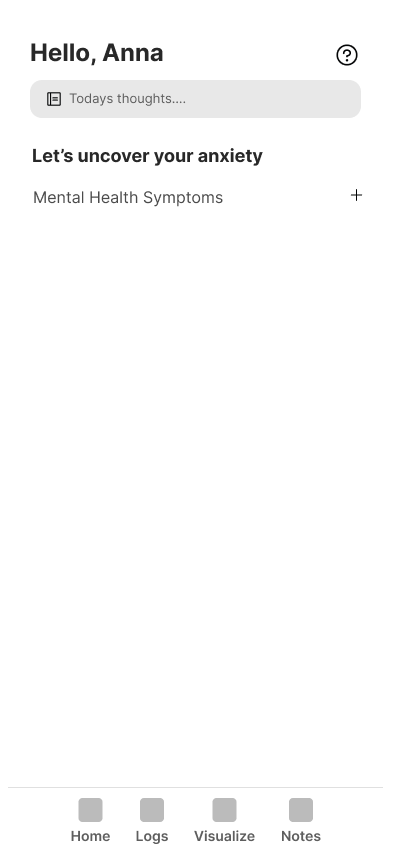
Early versions treated several modules as equally important. The refined direction made the primary reflection action easier to find and moved the symptom list into a supporting role.
THE LO-FIS ESTABLISHED
The tone of the product was a structural decision before it became a visual one.
These explorations did not define the final interface. They defined the conditions it needed to protect: clarity, agency, and nonjudgmental reflection.
- CONTEXT BEFORE COLLECTION
- NEUTRAL LANGUAGE
- USER-SELECTED FOCUS
- ONE CLEAR NEXT STEP
04 · MAKING IT VISIBLE
You can't lecture someone into curiosity.
I learned this the hard way. My early concept leaned on explanation — onboarding screens that walked users through Brewer's framework, the four domains, the protective function of anxiety, the whole intellectual scaffolding I'd fallen in love with. It was thorough. It was also a wall. People hit it and bounced.
Curious awareness can't be learned through tutorials. It has to be practiced.
So I stopped explaining and started building a place to practice. The design had to do three things at once: take the tangled knot of “I'm anxious,” pull it into a single thread, split that thread into domains you can actually look at — and then let the looking itself become the intervention.
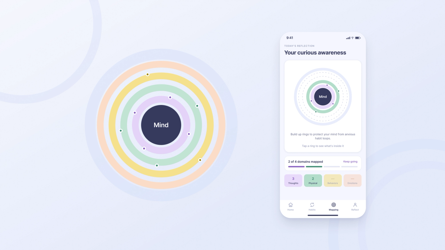
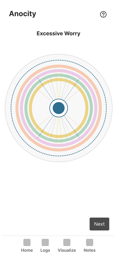
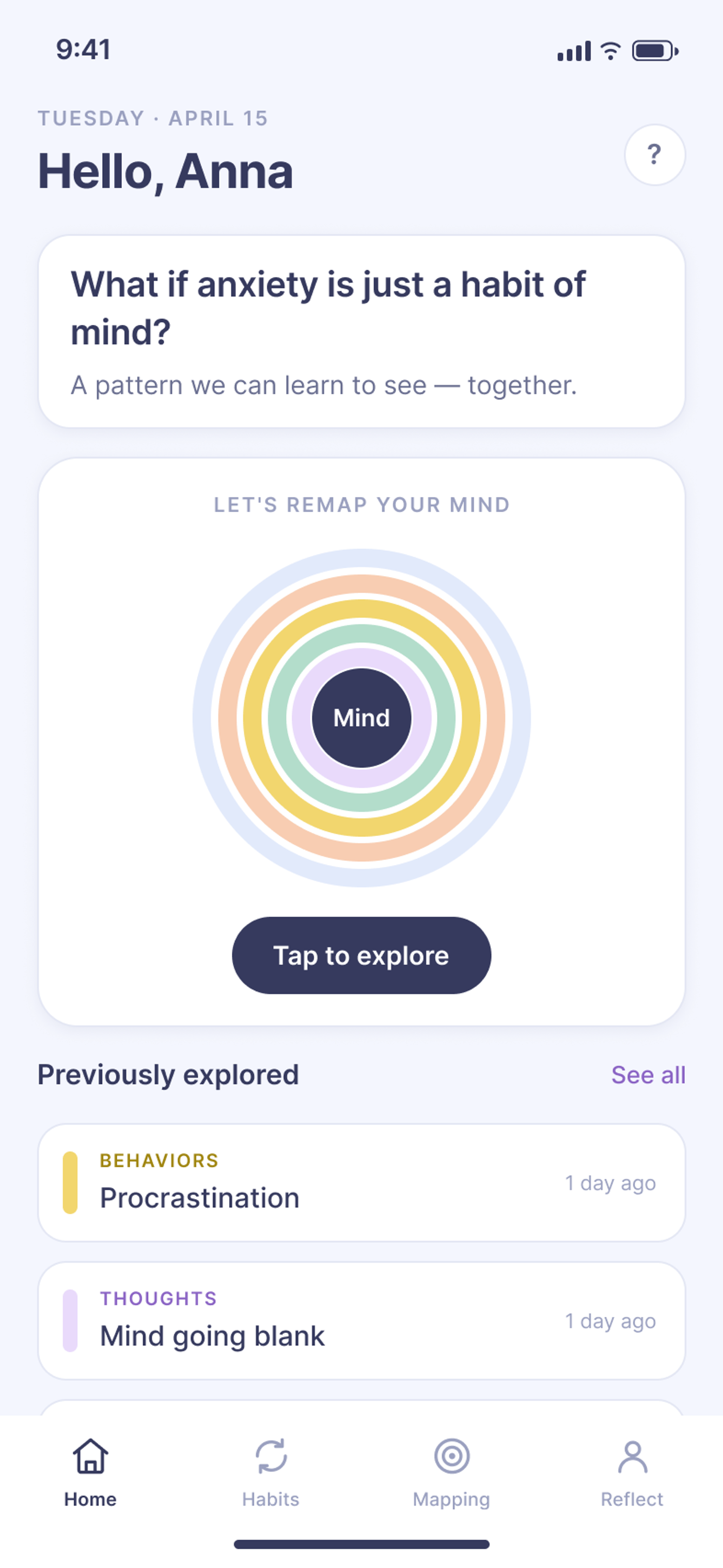
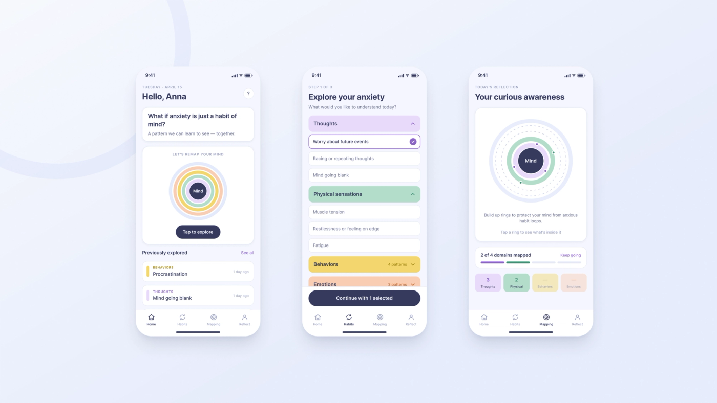
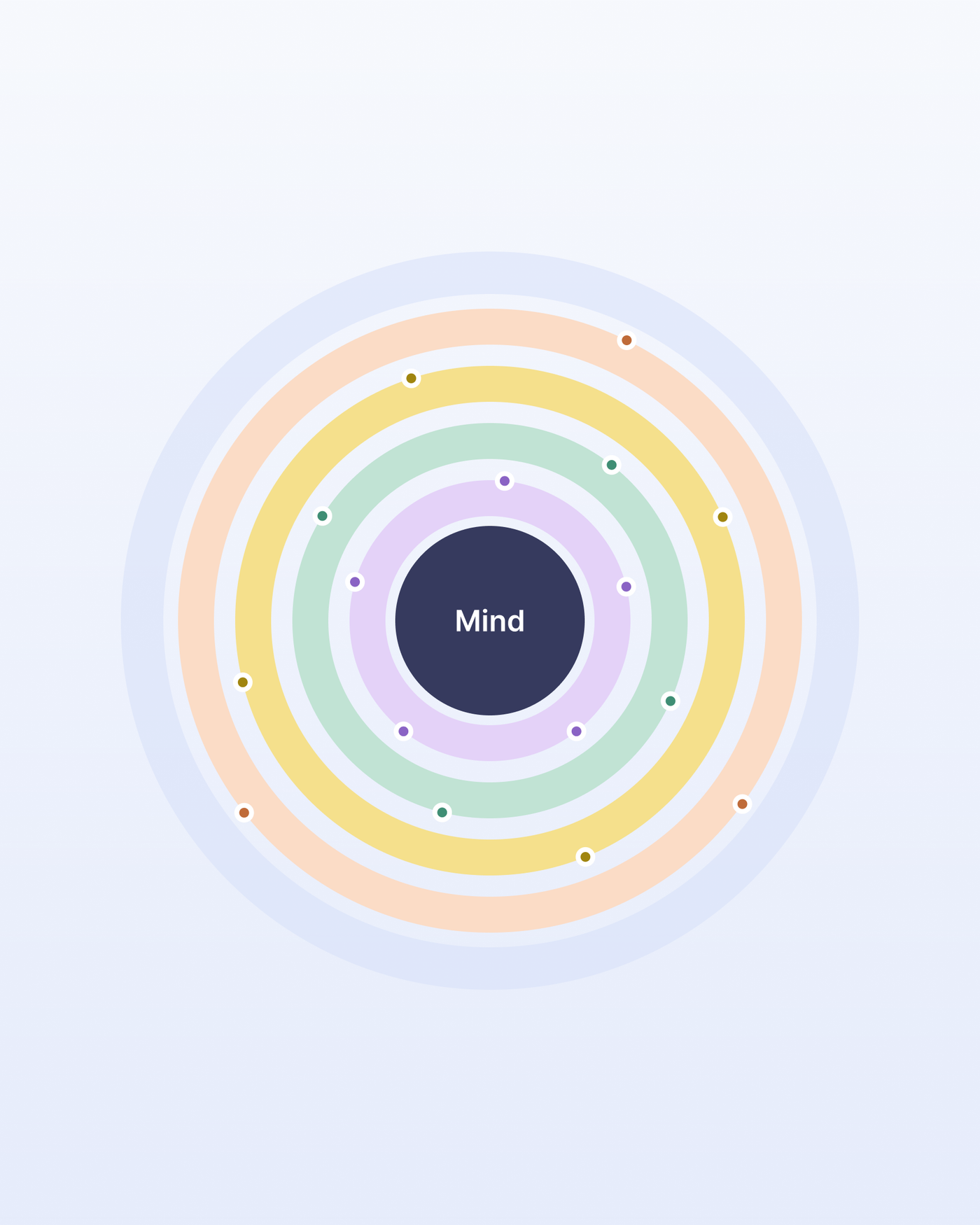
The breakthrough was the ring system — a dartboard, with Mind at the center. Each time you explore a domain, it adds a colored ring around that center: purple, green, yellow, blue. Reflections don't become a score. They become layers. Tangible ones, literally wrapping around the mind they came from.
The metaphor does quiet, deliberate work:
- It externalizes. The anxiety is now out there, on a screen, in front of you — not a fact about your character.
- It shows coverage, not severity. Empty arcs don't mean failure. They mean unexplored. The goal isn't a low number; it's a fuller picture.
- It rewards noticing. Every ring is proof you observed something you used to just feel.
Then I went through the interface line by line and pulled out everything clinical:
- “Mental Health Symptoms” → “What do you want to explore today?”
- “Symptom selection” → “Thoughts · Physical Sensations · Behaviors · Emotions”
- Scores, error-red, bright alerts → pastels, calm and non-triggering
- Required reflection → optional reflection, with soft prompts
The color choices weren't decoration. Bright palettes tested as “too energetic,” and red read as error — exactly the wrong message for a tool trying to say nothing here is broken. Pastels tested as “calming” and “gentle.” The aesthetic had a job, and the job was reducing stigma.
And reflection became optional — on purpose. When I forced it right after a session, people performed insight instead of having it. When I made it a gentle invitation — “What if anxiety is just a habit of mind?” — the reflections got more honest. Less homework, more discovery.
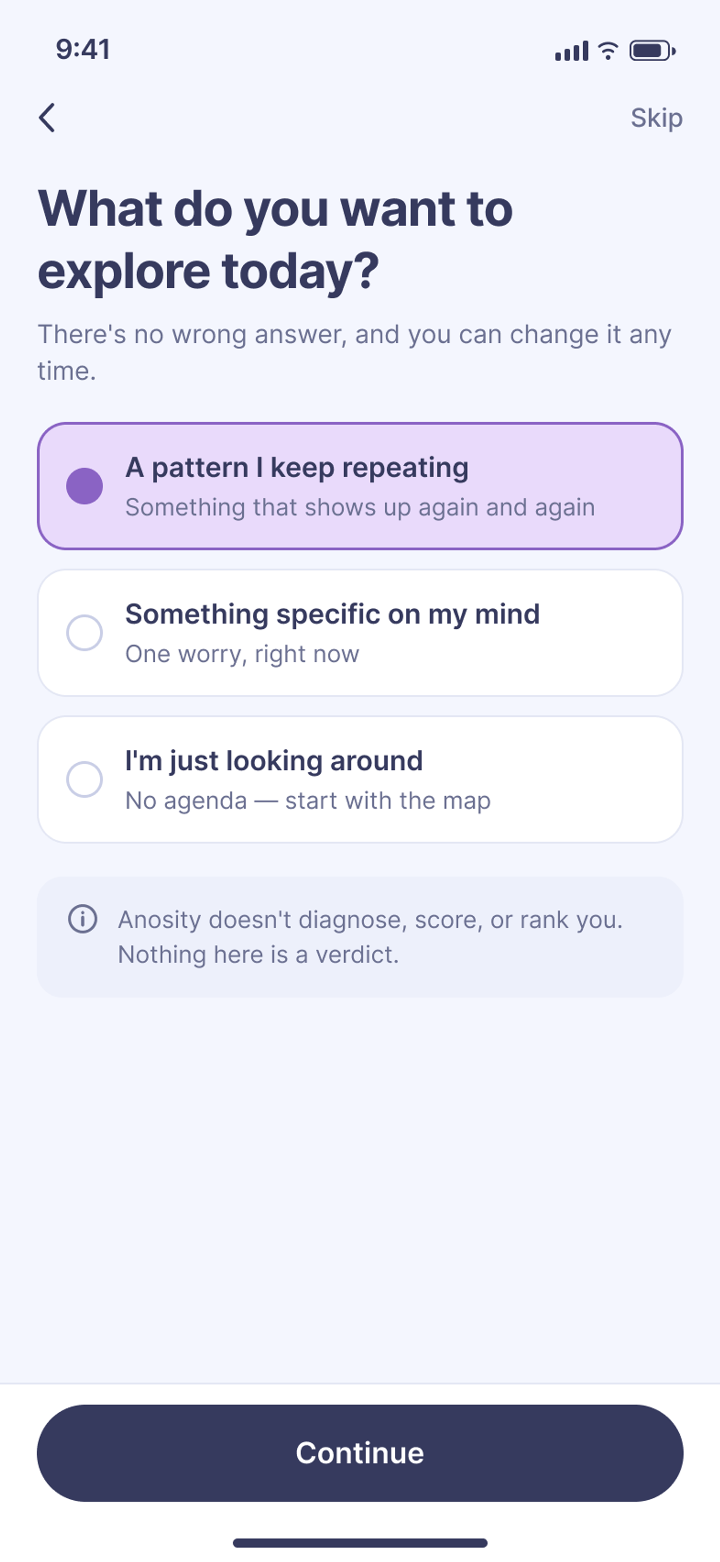
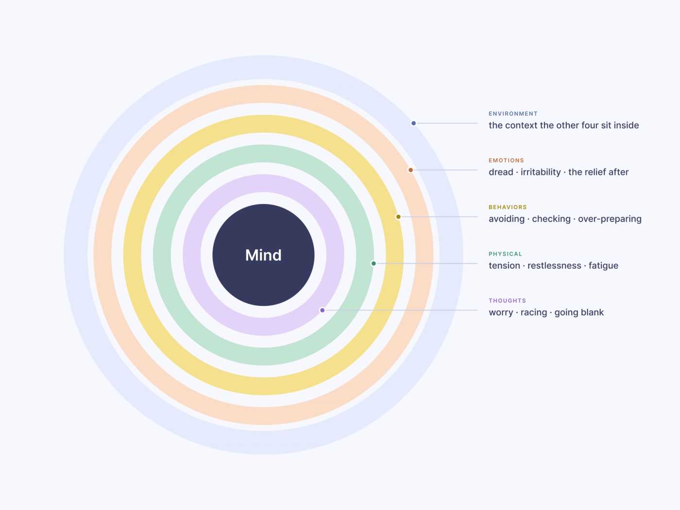
Pick a ring. Name what’s in it.
This is the mapping screen, pulled out of the phone. Choose a domain, then name the patterns that belong to you — each one lands on its own ring. Nothing here is scored.
Five rings. The outer one is your environment — the context the other four sit inside. The centre is the part that stays still.
NOTHING NAMED YET. THAT IS ALSO A RESULT.
05 · WHAT CHANGED
Anxiety stopped being a verdict.
The shift was small to describe and large to feel.
Anxiety stopped being a verdict and became data you could be curious about. Not “I'm an anxious person” but “huh — my thoughts and my body are both lit up today, and I haven't looked at my behaviors yet.”
The goal was not to calm users down. The goal was to help them notice what was already happening.
When I tested the language with classmates and my professor, the new framing landed exactly where the research said it should. People called it “less scary” and “more curious.” The four-domain structure read as clear without a single definition screen — the architecture was teaching the concept just by being navigated.
The ring did something subtler. People stopped asking “how bad is it?” and started asking “what haven't I looked at?” That's the entire reframe, compressed into one shift in attention — from severity to curiosity, from judgment to coverage.
06 · THE EXPERIENCE
Here, the app tells the story.
Here's the loop, end to end. It's short by design.
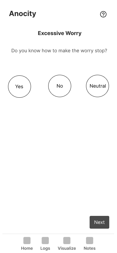
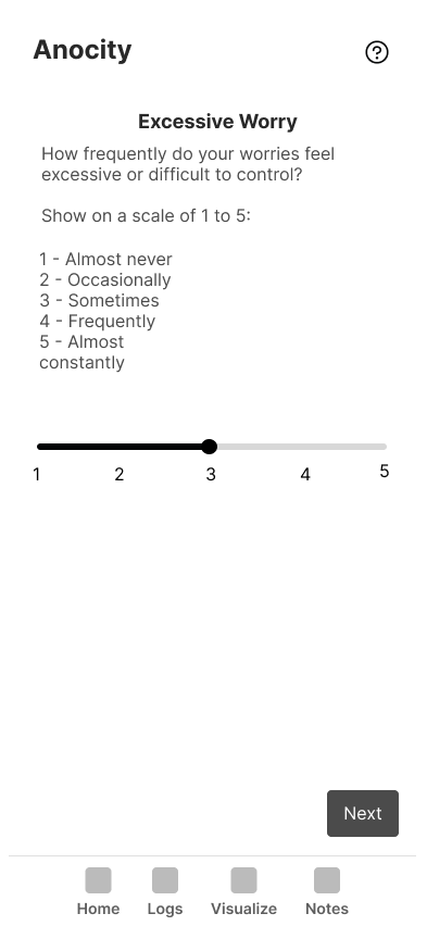
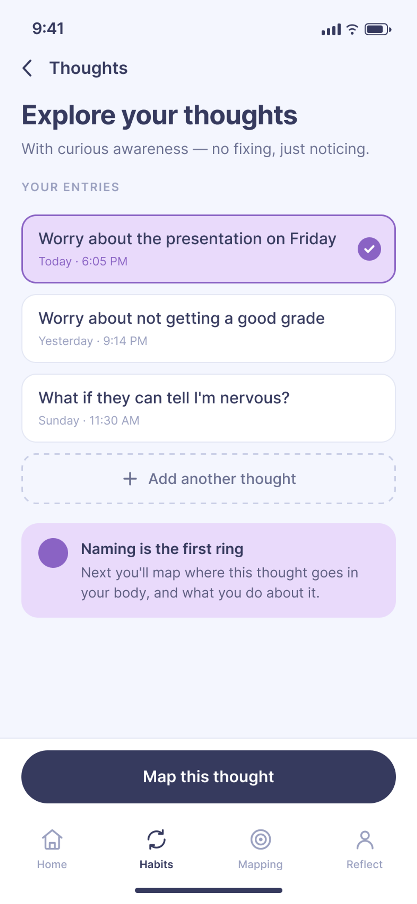
- Choose what to explore. Thoughts, Physical Sensations, Behaviors, or Emotions. No intake form. No diagnosis. Just an open question: What do you want to explore today?
- Answer a few guided prompts. Simple Yes / No / Neutral responses to questions like “Do you know how to make the worry stop?” Low stakes. No right answer.
- Reflect — if you want to. A soft, optional prompt invites you to revisit the moment with a little distance. Brewer's insight runs underneath this: reflection works because the emotion has cooled enough to let you actually learn from it.
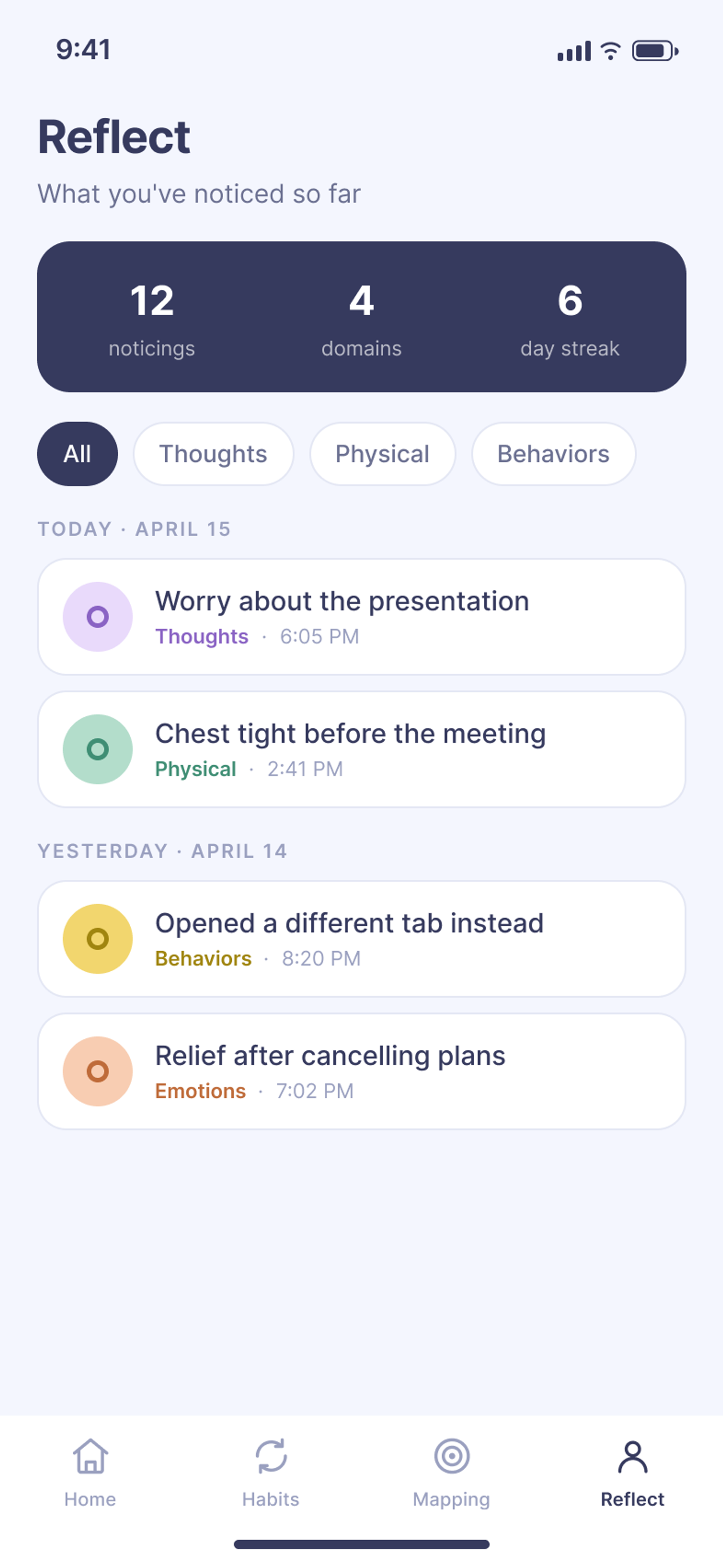
- Watch the ring grow. Your exploration adds a colored layer around Mind. Over time, the rings reveal your pattern — which domains you visit, which you avoid, where your anxiety actually lives. Not a score. A portrait.
No streaks to break. No red. No verdict. Just a system slowly coming into focus, drawn by the person living inside it.
07 · WHAT REMAINS
What still isn't visible.
I'm honest about the edges of this.
This was a 16-week academic project. The validation it has is real but informal — design critiques, classroom feedback, the structured judgment of peers and an instructor who knew the research. What I don't have yet is proof over time.
The open questions are the interesting ones:
- Does curiosity hold? I'd want a longitudinal study — 8 to 12 weeks — tracking whether people keep returning, keep exploring new domains, and actually start describing their anxiety differently. Or whether they quietly slide back into treating the rings like a score to optimize.
- Does the metaphor read on first contact? Progressive, fidelity-by-fidelity usability testing would tell me whether the dartboard teaches itself to a stranger — or whether it only made sense to me because I built it.
- Where's the line between observing and ruminating? Curiosity interrupts anxiety. But attention, pointed the wrong way, can feed it. That boundary deserves real study before this ever sits in someone's pocket unsupervised.
Naming what isn't visible yet is, fittingly, the same skill the app is trying to teach.
08 · WHY IT MATTERS
Build the place to practice, then get out of the way.
Anosity is one answer to a question I keep circling: how do you make something invisible, complex, and human easier to understand — without flattening it?
That question doesn't stop at anxiety.
The core finding here — people don't learn by being told how to feel; they learn by practicing a new way of seeing — is the central problem of learning design itself. It's the problem every AI tutor is about to get wrong. The instinct is always to explain more, onboard harder, add another tooltip. But curious awareness, like most things worth learning, can't be delivered. It has to be discovered through use.
The best way to teach a concept isn't always to explain it. Sometimes people need to practice it first.
This project taught me what designing for mental health actually means. Not making prettier, calmer interfaces — though that matters — but translating research into lived experience. There's a real gap between what we know and what people can use. Brewer's work on curiosity and anxiety could help a lot of people, and most of them will never read it, because it lives in journals and clinics, written in a language that already feels like a diagnosis. My job as a designer was to stand in that gap. To take something true and locked away, and build a door into it.
What changed for me wasn't a technique. It was a belief about how understanding happens. I used to think clarity was something you explain into someone. Now I think clarity is something you design conditions for — and then trust the person to find. I take a complex system, find the hidden pattern inside it, and turn it into something a person can see, hold, and navigate without shame.
Anxiety was just the first invisible system I tried it on.
CASE STUDY NOTES
Built for a Design & Mental Health course at Northeastern (Spring 2025), grounded in Judson Brewer’s Unwinding Anxiety (2021) and anxiety-stigma research. The thesis: anxiety isn’t a single feeling but a system running across thoughts, physical sensations, behaviors, and emotions — and curious, non-judgmental noticing, not streaks or scores, is what interrupts the loop. Anosity maps it instead of grading it.